Experiential Design // Task 2: Experience Design Project Proposal
20/5/2025 - 1/6/2025 / Week 5 - Week 6
Angel Tan Xin Kei / 0356117
Experiential Design / Bachelor of Design (Hons) in Creative Media

This week in class, Mr. Razif introduced us to how Augmented Reality (AR) can be integrated with interactive user interfaces. The focus was on incorporating UI buttons within an AR environment to control multimedia content. One of the key activities involved using AR-based UI elements to play or pause a video by interacting with virtual buttons placed in the AR scene. This hands-on task gave us a clearer understanding of how user input can be used to control media within immersive experiences.

|
| Fig 1.1 Scripting for Buttons and Media Actions |

|
| Fig 1.2 Aligning Buttons and Output |
As we advanced, Mr. Razif showed us how to streamline the interaction by replacing the conventional two-button setup (separate play and stop buttons) with a single toggle button. This toggle was programmed to switch between play and stop functions based on the video’s current state. The change made the interface more efficient and intuitive, aligning with best practices in interactive AR design.
For our final hands-on activity, we explored adding creative effects to boost user engagement. We implemented a feature where, after the toggle button was pressed more than five times, the video wouldn’t just stop—it would vanish from the scene with a dramatic explosion effect. This exercise challenged us to combine logical conditions with visual effects, offering a fun and practical experience in blending functionality with creativity in AR design.
This week, Mr. Razif guided us through the process of navigating between multiple UI canvas pages in Unity, deepening our understanding of interactive user interfaces within an AR environment. The lesson emphasized managing scene transitions and button navigation key elements in creating cohesive and user-friendly applications.
We were instructed to work with three distinct canvases: the AR canvas (which we had developed in previous sessions), a main menu scene, and a tutorial scene. Each canvas played a specific role in shaping the overall user experience. The AR canvas remained the central space for our video and AR interactions. To enhance this experience, we were tasked with adding an information overlay that could be triggered to appear over the video, providing users with additional context or instructions. A close button was also implemented, allowing users to dismiss the overlay at will, giving them greater control over the content displayed.

|
| Fig 2.1 Creating Pixel/ Panel in Canvas |

|
|
Fig 2.2 Scripting for Navigation Scene in Visual
Code |

|
|
Fig 2.3 Creating Visual Scripting for Further
Action
|

|
|
Fig 2.4 Drag and Drop the outcome to Respective
Scene
|

|
|
Fig 2.5 Create New Button for Navigating to
Other Scene
|

|
|
Fig 2.6 After Scripting and new Functions
created
|
In addition, we worked on developing the main menu and credit scenes, making sure that each button within these interfaces correctly navigated to the appropriate canvas or scene. This required setting up accurate button linkages and smooth transitions, allowing users to move effortlessly between the menu, tutorial, and AR experience. It was a valuable opportunity to learn about UI navigation logic, scene management in Unity, and the importance of designing a user-friendly interface flow.
By the end of the session, we had successfully created a basic yet fully functional multi-page UI system, complete with responsive buttons and seamless scene transitions. This reinforced our understanding of Unity’s UI framework and its essential role in crafting engaging AR experiences.
Requirement of Submission
- Slides submitted as .pdf format
- Online posts in your E-portfolio as your reflective studies
After finalised the idea, we proceeded to planning phase where we focused on refining and further developing the whole proposal. Our initial step was to identify and analyze the primary target users to ensure our design addresses real-world needs and delivers meaningful value.
Through a collaborative brainstorming session, we developed three key user personas, each representing a unique demographic with specific pain points that "Focus Space" is designed to solve. These personas will guide our design decisions and help us tailor the app’s features to meet the needs of our intended audience.

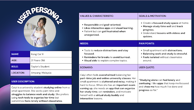 |
Figure 5.3 User Persona 2 |
 |
Figure 5.4 User Persona 4 |
Our User Experience Map outlines the typical journey individuals go through when they face difficulties in concentration when it comes to studying emphasizing emotional gaps and situational pain points they may sturggles. It helps us identify moments of onboarding, environment set up,using study tools,viewing learning cards, taking quiz and summary. Focus Space is designed to address these issues by offering a virtual study buddy guide app experience that provides study interactive engagement, and a sense of companionship and a tool to guide users for effective learning.
After identifying the touch points, pain points and gain points of each phases, we discussed and utilised the TDS XD Assitant to help us to propose some idea of what to maintain and solutions.Thus, we implemented some features where the app uses markerless AR (Ground Plane in Vuforia) to let users place study tools around their room. Key features include:
Study Timer: A floating Pomodoro-style timer UI in AR space
Study Buddy: A 3D character that speaks motivational lines and suggests breaks
Learning Cards: AR pop-ups explaining concepts like photosynthesis (animated leaf + arrows + voiceover)
Quiz
- Summarize Long Paragraphs into Mind Maps
- Ambient Sound: Calming rain, café, or nature sounds to improve concentration
 |
Table 1.3 New User Journey Map |

|
Fig 5.5 Sketches of App Flow Fig 5.6 Finalised the App Flow 7)Visualisation Design Planning Since we're developing a study-focused app, we chose a calm and cool color scheme to promote focus and relaxation. The selected palette is designed to be visually soothing and easy on the eyes, supporting long periods of use without causing fatigue. This color scheme of light mint green and purple not only aligns with the app’s purpose but also enhances usability by maintaining clear contrast and readability throughout the interface. |
 |
| Fig 5.7 Art Direction |
We drew inspiration for our app from several sources to shape both its functionality and visual style. The interactive and gamified learning approach was heavily influenced by Duolingo and some Pinterest, particularly in how it keeps users engaged through short, manageable tasks and motivational elements.
 |
| Fig 5.8 Landing Page and Dashboard |
For our content visuals especially for the Learning Cards, we referenced high school biology textbooks, which provided clear diagrams and straightforward explanations of complex topics like heart circulations, its anatomy parts and cell structure.
In terms of visual design and AR elements,we gathered ideas from Sketchfab and Unity’s asset store, where we explored various 3D models and environments that matched our calm, educational theme. These resources helped us better understand how to create appealing AR experiences that are both educational and visually engaging. Our app consists of three main feature pages, each designed to support focused and interactive studying:
Pomodoro Timer:
This feature provides a floating countdown timer based on the Pomodoro technique. It helps users manage their study sessions by alternating between focused work periods and short breaks, boosting productivity and concentration.
 | |
|
Scan for Quiz:
This page allows users to scan AR markers or surfaces to launch quiz questions in AR space. The interactive quiz format helps reinforce understanding and makes revision more engaging.
 | |
|
Scan for Notes:
On this page, users can scan a flat surface to display concept cards or animated notes in AR. These visual aids explain key topics with graphics, animations, and optional voiceovers for better comprehension.
 | |
|
 |
| Fig 5.12 Overview of Main MVP Flow in Figma |
Mr. Razif noted that our finalized idea, Focus Space, was solid and good to proceed. However, he advised us to be more specific about the content. In particular, he recommended clearly outlining which topics will be covered and detailing the types of concept cards and quiz formats to be included, aimed to help us better define the project scope and deliver a more focused and effective user experience.
Mr. Razif commented that the prototype looks good and that all the essential materials have been successfully included in the proposal.
While developing the Focus Space app, I observed how important it is to create a digital environment that promotes concentration, especially for users who struggle with distractions. By incorporating calm colors, ambient sounds, and a clean interface, we were able to design an experience that visually and mentally supports studying. The use of markerless AR also allowed for a more immersive and personalized setup, letting users place study tools in their actual physical space, which added a layer of realism and emotional connection.
Findings:
Through user research in journey map and experience map also feedback sessions and proposed solutions, we discovered that users appreciate features that not only help them stay on track but also make studying feel less monotonous. The Pomodoro-style study timer and the interactive Quiz and Concept Cards were particularly well received, as they provided both structure and motivation. Additionally, we found that users valued the ability to convert long text into visual mind maps, which helped with better retention and understanding. This highlighted the importance of combining functionality with user-friendly visual aids.I also learned that Malaysian having high rates of remote workers and learning take co-working space to be significantly impact their efficiency in learning and work productivity.
Experience:
Working on Focus Space was a valuable learning experience that deepened my understanding of user-centered design, AR integration, and interactive UI development. Collaborating with my team to bring this concept to life allowed me to practice problem-solving, iterate based on feedback, and pay close attention to emotional design elements. Overall, the project taught me how to balance creativity with practicality and how thoughtful design can truly enhance a user’s productivity and learning experience.


Comments
Post a Comment