Game Development // Task 2: Art Asset Development
21/4/2025 - 8/6/2025 / Week 1 - Week 7
Angel Tan Xin Kei / 0356117
Games Development / Bachelor of Design (Hons) in Creative Media

- PDF or Google Doc.
- Online posts in your E-portfolio as your reflective studies.
Task Distributions (Overall):
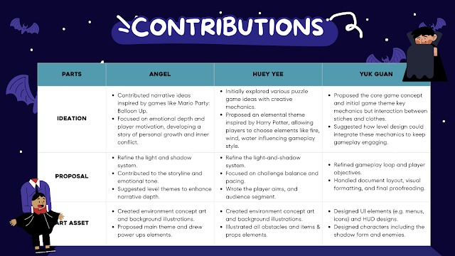
Task Distributions Table
My main contributions focused on designing the initial Level 1 background, light obstacles, protection props, and the character’s idle and dash animations. I used Adobe Illustrator to create the game’s visual assets, ensuring they matched the surreal and emotional tone of our concept. By carefully crafting these elements, I helped establish a cohesive visual direction and atmosphere for the early gameplay experience.
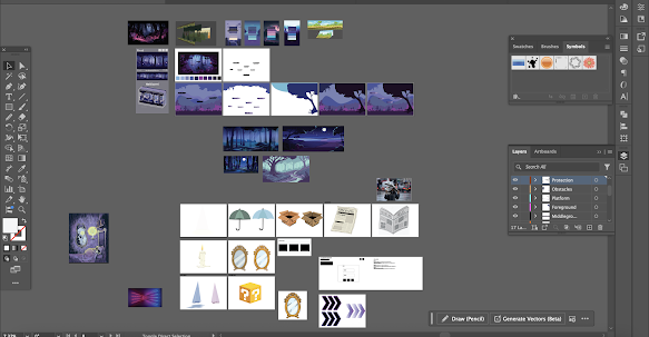
Design Progress in Adobe Illustrator
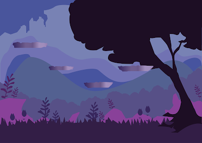
Initial Level 1 Background Design - Version 1
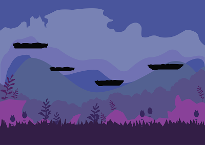
Initial Level 1 Background Design - Version 2
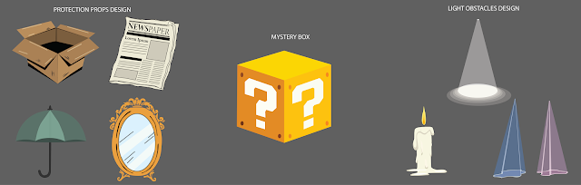
For the Protection Props Design, we created items such as a box, newspaper, umbrella, and mirror—each allowing the shadow character to hide from or deflect light.
To add an element of surprise and engagement, we introduced the Mystery Box mechanic, where players won’t immediately know which prop they’ve collected until it’s used, enhancing curiosity and replay value.
In the Light Obstacles Design, we developed challenging elements like Light Beams, Candle Walkers, and Light Traps, all requiring careful timing and strategy to avoid. These obstacles reinforce the game’s central theme, light as both a threat and a puzzle while keeping gameplay dynamic and immersive.
Elements Design
I utilized both Adobe Illustrator and Adobe Photoshop to create and animate the character’s idle and dash movements, ensuring smooth transitions and a visually cohesive style. I then tested these animations using the Unity 2D template, where they successfully functioned within the game environment. To give our lecturer, Ms. Bong, a clearer understanding of our game’s visual and animation style, I’ve also provided video recordings of these animations as part of our presentation.
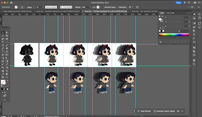
Animation Progress - Create Spritesheet in Adobe Illustrator
Boy Character's Animations:

Boy Character's Idle Animation - Shadow

Boy Character's Idle Animation - Character

Boy Character's Dash Animation
Girl Character's Animations:

Girl Character's Idle Animation - Shadow

Girl Character's Idle Animation - Character

Girl Character's Dash Animation
Obstacles Animation:

Obstacles Animation - Candle Walker
At the beginning of our project, we divided our responsibilities based on each member’s strengths and interests. This helped us work efficiently and ensured everyone contributed meaningfully to different parts of the game development process. Here's how we distributed the tasks:
- Character Concepts and Movement Animation: [Siang Huey Yee and Phoon Yuk Guan]
- UI/UX Design and HUD Design [All]
- Background and Overview Design: [All]
- Proposal Formatting & Documentation: [Angel Tan]
I started with the first draft of the visual direction, which included an initial moodboard, concept sketches, and colour palette ideas. These visuals set the tone for the game's emotional journey, aligning with our narrative of a shadow character facing the light.

|
| Fig 5.1 Level 3 background design |


|
Fig 5.2 Level 1 environment element |

|
|
|

|
|
|

|
|
Fig 5.4 Gain Points Emotion Bubbles |
We presented our first draft and game proposal to the class and received valuable feedback from our lecturer and peers. One major point was that our illustration must add shadows and textures and background must be mnore in depth and UI elements miust be individual layers and not be3en cut off edges.Characters shadow can be added mor eshadows and adjust the opacity.

|
| Fig 5.5 Week 5 presentation in class |
Key changes:
- Adjusted background layers to create more depth and movement
- Refined lighting and texture to reflect the emotional tone of each level
- Introduced visual cues for gain points (e.g., glowing fragments of memory)
- These modifications helped enhance both visual storytelling and gameplay clarity.

|
|
Fig 5.6 Level 1 background design |

|
| Fig 5.7 Level 2 Background Design |
To bring everything to life, I animated several elements using Adobe Photoshop and input it into Unit.
After completing the animations, I imported them into Unity and set them up as interactive slide animations within the game scenes. This allowed our backgrounds and UI to feel more alive and responsive to the player’s actions. Integrating them into Unity helped simulate how our game would play and transition between scenes.

|
|
|
Phoon Yuk Guan
As we moved on to Task 2: Art Asset Development, I took on the responsibility of designing both the UI elements and the main character for our game, Shadowed Self. This was an exciting stage for me because it allowed me to blend visual creativity with functional design.
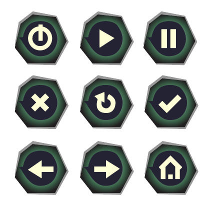
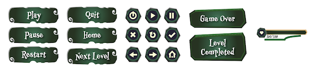
1) UI Elements
Before diving into the UI, I took time to carefully examine the background designs created by Huey Yee and Angel. Their work established a strong visual foundation for the game, with a unique mix of cute, funky, and horror elements. I wanted to ensure that my UI design not only stood out visually but also felt cohesive with their backgrounds.
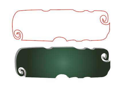
Taking inspiration from their palette and mood, I chose green as the main color for the UI elements. It contrasts well with the darker backgrounds while still feeling eerie and natural—almost like a haunted forest. To enhance the theme further, I added a subtle horror-style pattern along the borders of the UI buttons, giving them a mysterious, overgrown jungle vibe.
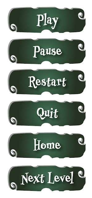
For the font, I selected Professor Minty. It fits perfectly with our quirky-horror aesthetic—playful yet unsettling—and adds character to the menus and button labels without overwhelming the visuals.

After finalizing the button design style and selecting the typography (Professor Minty), I moved on to designing the actual UI buttons used in the game. These include the essential gameplay functions: Play, Pause, Restart, Quit, Home, and Next Level.
Each button follows the same consistent visual style I had established earlier—with a green base color and horror-themed border details to maintain the overall funky horror jungle vibe.
After completing the main function buttons, I continued by designing the icon-based buttons, These icons were created to support additional in-game interactions and settings, while keeping the interface visually clean and intuitive. I used the same green color base and creepy border pattern to maintain visual consistency, but ensured the icons were instantly recognizable even at smaller sizes. This part of the process helped me think more deeply about user experience (UX)—especially how players quickly understand symbols and navigate the game without needing extra explanation.
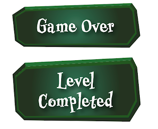
Then, I created two final visual elements: the "Game Over" screen and the "Level Completed" screen. These are meant for display purposes only.
And lastly, I created a Health bar for UI Elements as well.

Below is the overall design for UI Elements.
2) Character Design
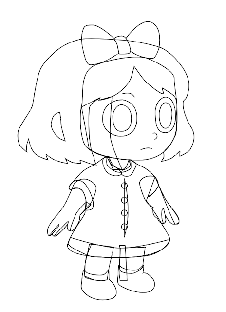
As part of my task delegation for Task 2: Art Asset Development, I was in charge of designing the main characters for Shadowed Self. One of the key challenges I faced was creating a character that felt cute yet unsettling, in line with our game’s unique theme—a balance of eerie, emotional, and childlike charm.
To achieve this, I began by sketching out a few rough ideas. I decided to use a chibi-style proportion where the head is larger than the body, giving the characters an adorable and approachable silhouette. Their short limbs and round eyes emphasize innocence, which adds a layer of emotional connection for players.
Since our gameplay allows players to choose their character at the start, I created two versions:
- A boy character with short, slightly messy hair, a collared button-up shirt, and dark blue pants.
- A girl character with a bob haircut, a red bow, a collared dress, and black shoes.
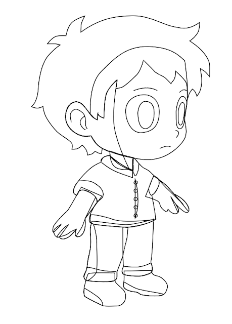
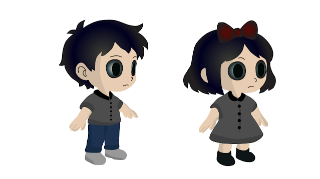
Moving on, after finalizing the character outlines, I began working on the coloring phase. This stage was especially important because I wanted the colors to not only look good visually, but also carry emotional weight that matched the tone of the game.
Despite their cute chibi proportions, I made sure to incorporate subtle horror elements through color and expression:
Both characters were given oversized, hollow black eyes—this was a deliberate choice to create a haunting, soulless appearance. It visually suggests that something is missing, or that the characters are emotionally lost, perfectly tying back to the central shadow theme of our game.
I chose a muted color palette using mostly greys, black, and navy tones. These colors help maintain a somber and mysterious vibe, reinforcing the eerie environment they exist in without making the visuals too harsh or scary for players.
Lastly, I kept the facial expressions neutral and minimal. The blank stares give them a slightly unsettling feeling, as if they are wandering through an unfamiliar, dreamlike world. This choice enhances the mood of emotional emptiness and isolation, while still allowing players to project their own feelings onto the characters.
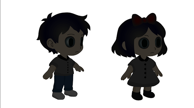
Since our game mechanics state that players will begin the game as a shadow form in Level 1, I needed to create a shadow version of both characters. This version represents the character in their incomplete state—before they start collecting shadow pieces and regaining their full form.
Initially, I tried making the entire body a flat grey color to represent the shadow. However, I quickly realized that this approach caused important details—like the eyes, face, and clothing outline—to blend together and become almost invisible. The character lost too much of its form, which made it hard to read visually in the game environment.
To solve this, I decided to take a more layered approach. I duplicated the original character and created a dark grey silhouette, but instead of replacing the colors entirely, I lowered the opacity of the grey version and overlaid it on top of the original colored character. This gave it a transparent, ghostly shadow effect while still allowing some of the original details to subtly show through.
This method kept the shadow form readable and consistent with the rest of the game’s visual language, while also clearly showing that the character was in a weakened or “lost” state. It also visually supports the core gameplay goal: as players progress and collect shadow pieces, the character gradually becomes more solid and complete.
3. Animation of Characters
After finalizing our character designs and completing the other art assets developed by my group mates, the next step was to bring our characters to life through animation. This was a crucial part of the development process because we wanted the characters to feel responsive, expressive, and smooth during gameplay.
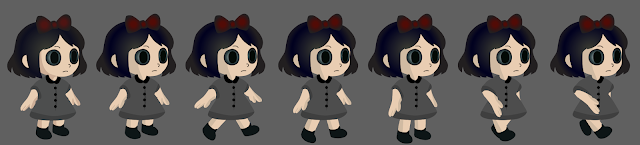
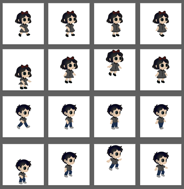
For my task, I was in charge of creating all the character animations, which included:
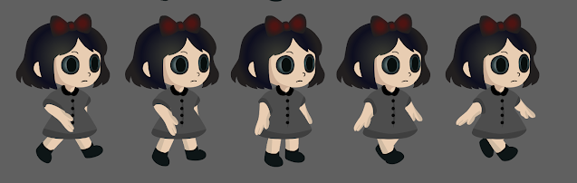
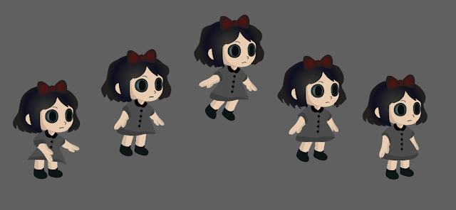
Girl Character: Walking & Jumping
Shadow Girl: Walking & Jumping
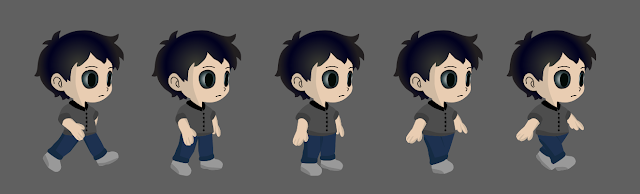
Boy Character: Walking & Jumping
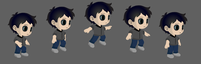
Shadow Boy: Walking & Jumping
Initially, we discussed using Unity’s bone system (2D rigging) to animate the characters. However, after some testing and considering the style of our game, we decided to use the sprite sheet method instead. This gave us more control over the specific look and motion of each animation, especially since our characters are in a stylized chibi form.
With this decision, each animation needed to be drawn frame-by-frame, with around 5–6 frames per action. This was both challenging and exciting, as it pushed me to think more deeply about timing, movement, and consistency in visual style.
I started with the girl walking animation first. I broke down the motion into key poses—such as the contact, lift, pass, and down positions—to make the movement feel fluid.
After finishing my first draft of the girl’s walking animation, I took a step back to review the movement. At first glance, it looked okay—but something felt off. The motion wasn’t smooth, and the character’s walk didn’t feel natural. The legs looked stiff, and the overall rhythm didn’t match the pace we were aiming for in the game.
I realized that while I understood the basic idea of animating frame by frame, I needed to dig deeper into animation fundamentals to really get it right.
So, I went online and began studying walk cycles—breaking them down frame by frame. I watched several tutorials, read articles, and analyzed examples from other 2D games and animation guides. I learned about key poses like the contact position, passing position, and recoil, and how each of them plays a crucial role in creating a believable walk.
By comparing these with my original frames, I could immediately spot where my animation lacked proper weight and rhythm. The feet weren’t grounded correctly, and the body lacked natural sway. After studying these principles, I went back to redraw the frames—adjusting limb positions, refining the foot placement, and tweaking the timing of each frame to make the walk feel more fluid. So here is the refined girl walking animation frames:
After finalizing the revised walk cycle for the girl character, I moved on to the next animation: the jumping animation. Unlike walking, jumping required me to think about vertical movement, timing, and how to capture the feeling of weight leaving the ground and landing back down.
Following the same animation structure and principles I applied to the girl character, I proceeded to animate the boy character’s walk and jump cycles. Since the boy and girl characters share a similar chibi style, I was able to use the same approach, but with slight adjustments to reflect his unique design and posture.
Once the walk cycle was complete, I moved on to the boy jumping animation. Again, I followed the same core stages: crouch, take-off, mid-air, and landing. I adjusted the limb positioning and movement slightly to fit his frame and ensure consistency with his overall design.
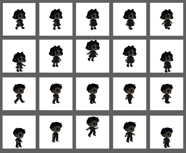
Before importing the animations into Unity using sprite sheets, I had to go through a few important preparation steps to ensure everything would work smoothly. Unity requires sprite sheets to be well-organized and evenly spaced, so I needed to carefully set up my files in Photoshop (PSD format) first.
To begin, I created individual artboards for each animation frame. Each artboard was one square per frame, and I made sure that every movement—whether walking, jumping, or idle—was centered in the middle of its artboard. This helps Unity properly slice the sprite sheet later on and ensures that each frame transitions smoothly without any jittering or misalignment.
In addition to the main character animations, I also created the shadow versions of each animation. Using the darker, semi-transparent shadow design I developed earlier.
Final Animations:
Character Girl Walking:

Character Girl Jumping:

Shadow Girl Walking:

Shadow Girl Jumping:

Character Boy Walking:

Character Boy Jumping:

Shadow Boy Walking:

Shadow Boy Jumping:

Final Submission of Game Design Document
We presented our first draft and game proposal to the class and received constructive feedback from both our lecturer and peers. One key suggestion was to enhance our illustrations by adding more shadows and textures, and to create deeper, more immersive backgrounds. It was also pointed out that UI elements should be designed as separate layers with clean, non-cut-off edges.Additionally, we were advised to improve the character shadows by adjusting their opacity and layering. This feedback prompted us to re-evaluate our design priorities and inspired new ideas to further refine the overall game experience.
Game Title: Shadowed Self
Brief Description:
Shadowed Self is a 2D narrative-driven puzzle-platformer where you play as the lost shadow of a child, separated from your true self and afraid of the light. Set in a surreal, dreamlike world filled with flickering lights and eerie childhood spaces, you must navigate through shadows, solve light-based puzzles, and recover pieces of your identity. The game explores themes of self-acceptance, fear, and emotional healing, making players reflect on what it means to become whole again.
Week 5
Experience:
The ideation phase for Shadowed Self was one of the most creatively exciting parts of the project. Initially, each of us had very different ideas in terms of genre, theme, and mood. As we moved forward and shared inspirations, we explored a variety of mechanics and emotional narratives eventually landing on a surreal and symbolic game rooted in shadow, light, and identity. While the core concept leans toward a dark, dreamlike experience, we still wanted the gameplay to feel simple and intuitive, something approachable like Mario Kart, but with emotional weight.
This phase taught me the importance of not only aligning our ideas as a team, but also supporting each other’s strengths and being open to changes. Every iteration whether in story, mechanics, or visuals brought us closer to a clearer and more cohesive direction.
Observation:
As development continued, I realized that balancing gameplay with a meaningful narrative is far more complex than expected. Referring to Game Flow Theory, a well-designed game should touch on multiple psychological factors such as Sensation, Fantasy, Narrative, Challenge, Control, Curiosity, Surprise, and even Submission.
For Shadowed Self, the added challenge was embedding a moral narrative with the themes of fear, self-doubt, light vs. shadow, and self-discovery into the very mechanics of the game. We didn’t want the message to be spoon-fed; we wanted players to feel it. That meant every design choice whether it was level structure, asset motion, or how players collect pieces of themselves , had to support the overall theme naturally.
Findings:
This project helped me understand that the deepest impact comes when gameplay and story work together seamlessly. A game that’s only fun but lacks depth can feel hollow. On the other hand, a game that’s rich in meaning but lacks playability may fail to hold a player’s attention.
Through feedback sessions and iterative improvements, I’ve learned that mechanics should carry meaning, not just function. From animating light fragments to refining background transitions in Unity, every asset became part of the story and that integration made the game feel more alive.
In short, Shadowed Self taught me not to treat story and mechanics as separate lanes, but to design them as two parts of one emotional journey. I’ve gained a deeper appreciation for the creative process in game development, and I’m excited to carry this mindset into future projects.


Comments
Post a Comment