Information Design / Exercises
Information Design / Bachelor of Design (Hons) in Creative Media
Information Design / Exercises
- Instruction
- Lectures
- Exercises 1: Quantifiable Information
- Exercises 2: L.A.T.C.H Infographic Poster
- Feedback
- Reflection
- Quantify raw data and visualize information as a photograph
- Visual representation of numerical data that allows for easy interpretation and analysis.
Instruction:
Gather a set of objects and separate it into category such as color, shape, pattern, and other quantifiable factor.
Example:
1. Box of Lego
2. Jar of button
3. Jar of marble ball
4. Set of colourful rubber strap & more.
In this exercise you're required to quantify our chosen objects and arrange them into a presentable layout or chart. The information must be presented as is, and you need to arrange the objects with relevant indicators written out with pens to help you to visualize the quantity and data. The examples of objects that can be use are buttons, coins, lego pieces, M&Ms, and more.
- List infographics
- Statistical infographics
- How-to infographics
- Timeline infographics
- Comparison infographics
- Map and location infographics
- Flowchart infographics
- Process description infographics
- Location
- Alphabet
- Time
- Category
- Hierarchy

|
|
Fig 3.1 Progression of Pattern ( Arranged
)
|

|
|
Fig 3.2 Progression of Pattern ( Arranged
) |

|
|
Fig 3.3 Progression of Pattern ( Arranged
) |

|
|
Fig 3.4 Progression of Pattern ( Arranged
) |

|
|
|

|
|
|


|
| Fig 7.1 Sketch #1 |

|
|
|

|
| Fig 7.3 Sketch #3 |
Mr. Shamsul commented that Sketch 1 and 3 are quite interesting and intuitive but suggested combining the layouts by placing the filtration coffee in the center instead of the map to better emphasize coffee as the main theme of the poster.
D. Digitisation

|
| Fig.8.2 Attempt of Poster |
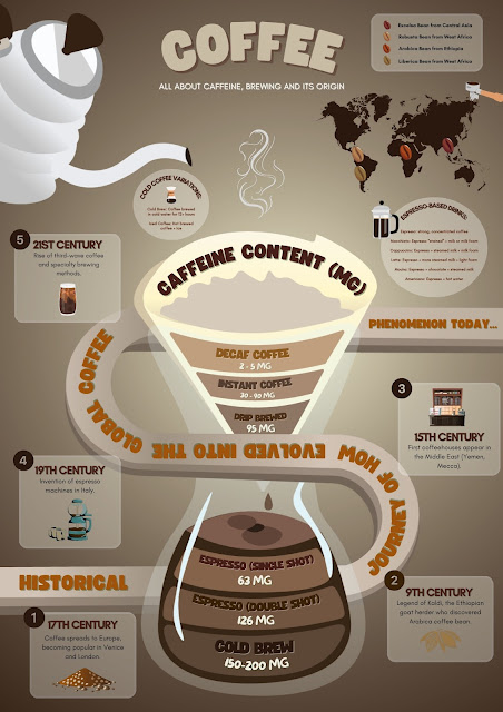
Mr. Shamsul highlighted the importance of typography selection in shaping the poster’s style. Since coffee is targeted at an adult audience, he advised me of using a refined italic or formal business typeface instead of a playful one to create a more sophisticated and professional appearance.
Mr. Shamsul emphasized that typography selection is crucial for the poster, as it helps convey its overall style. Since coffee is primarily associated with adults, he recommended using an elegant italic typeface or a formal business font rather than a playful one to maintain a more sophisticated and professional look.
Through these exercises 1, I was organizing and presenting data in a way that effectively communicates a story. In Exercise 1, I initially structured the categories based on quantity, experimenting with different patterns to determine the most suitable representation. However, after receiving feedback from Mr. Shamsul, I realized that adding more contextual information would enhance both clarity and engagement. By incorporating numerical order and a color gradient from cool to warm tones, I was able to create a more intuitive and visually appealing chart.
In Exercise 2, where I developed the coffee infographic poster with applied the LATCH principles to structure the information effectively. As a coffee enthusiast, I enjoyed researching and illustrating an introduction to coffee. To refine my design, I gathered visual references and created multiple sketches and draft layouts. Mr. Shamsul provided valuable feedback on layout and typography, emphasizing the need to highlight filtration coffee in the center and use elegant or formal typefaces to suit the theme. Based on his advice, I adjusted the composition, illustrated the background in Illustrator, and carefully selected fonts to enhance the poster’s overall aesthetic.


Comments
Post a Comment