Interactive Design :Project 2 / Working Web Page
Angel Tan Xin Kei / 0356117
Interactive Design / Bachelor of Design (Hons) in Creative Media
Project 2 / Working Web Page
⋆ ˚。⋆୨୧˚ Index ˚୨୧⋆ ˚。⋆
⋆ ˚。⋆୨୧˚ Instruction ˚୨୧⋆ ˚。⋆
The Objective of this assignment is to transform our static prototype from
Project 1 into a fully functional and interactive web page. We will use our
web layout class knowledge to create a website that closely matches your
original prototype.
1. Review and Analyze: Revisit our static prototype from Project 1 and analyze
its layout, typography, color scheme, and imagery.
2. Implementation: Use HTML and CSS to convert these design elements into
code, ensuring a faithful representation of the original prototype.
3. Precision and Responsiveness: Strive for pixel-perfect precision while
adhering to responsive design principles to ensure compatibility across
different devices and screen sizes.
4. Deployment: Upload the final web page to Netlify, update e-portfolio with
documentation of the entire process in your blog, and submit the Netlify link
as your assignment submission.
⋆ ˚。⋆୨୧˚ Practical ˚୨୧⋆ ˚。⋆
As we need to replicate the prototype that we have designed in Project 1 so it is essential to divide into parts from header to footer of the whole framework to easier adjust on the html and css. Firstly, I have added everything data into the html first including images and background and the contents.
Document Setup and Metadata:
The HTML document begins with essential declarations (<!DOCTYPE html>) and metadata (<meta charset="UTF-8">, <meta name="viewport" content="width=device-width, initial-scale=1.0">) to ensure proper character encoding and responsive behavior across devices.
Title and External Resources:
It includes a meaningful title (<title>Angel Tan Xin Kei - Digital Resume</title>) for the webpage, optimizing for search engines and user clarity. External resources are linked, such as a custom stylesheet (<link href="style.css" rel="stylesheet" type="text/css">) for design consistency and Google Fonts for custom typography.
The Navigation Section:
The navigation (<nav>) is structured using an unordered list (<ul>) with list items (<li>) encapsulated in <div> tags (<div class="resume">, <div class="aboutme">). These divisions help organize navigation links to key sections like "RESUME", "ABOUT ME", "EXPERIENCE", and "EXPERTISE".
 |
| Fig1.1 Nav Section |
 |
| Fig1.2 Nav Section with Hamburger Menu |
To ensure mobile responsiveness, an input checkbox (<input type="checkbox" id="menu-toggle">) and a corresponding label (<label for="menu-toggle" class="menu-icon">☰</label>) are used. This setup creates a hamburger menu icon (☰) that toggles the display of navigation links on smaller screens, enhancing usability.
 |
| Fig1.3 Nav Section for HTML |
 | ||
|
 |
| Fig1.5 Nav Section for CSS pt.2 |
 | |
|
The Body Content Section:
To begin with, I started off by ensuring everything go smoothly, I have implement the scroll-behavior: smooth for the websites.Also, added the fonts by my body to be "Anek-Malayalam" because I love this sans-serifs font with clear and higher readability.
 | |
|
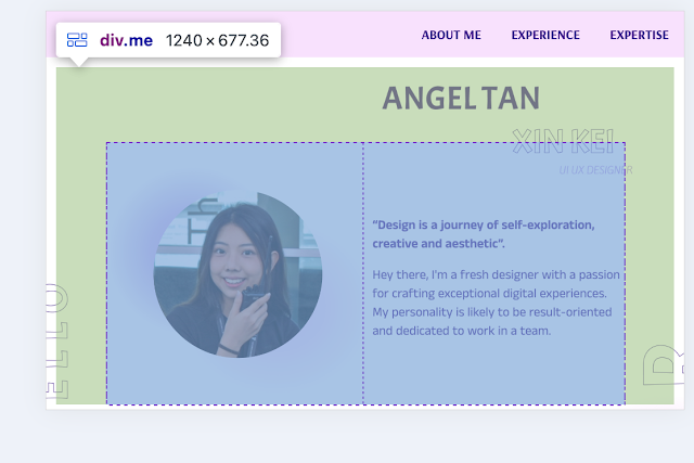
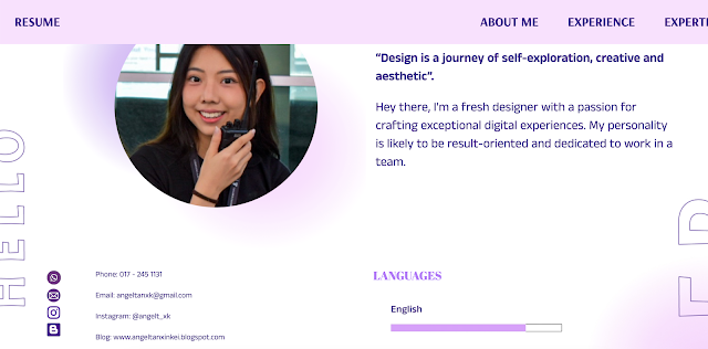
The main content area (<div class="container">) was organized into several sections (<div class="content">, <div class="me">, <div class="two-column">, etc) to easier adjust the margin, width and padding. Each section employs nested <div> elements with specific classes (class="content", class="me", class="two-column") to structure and display different types of content, such as images, quotes, contact information, educational background, skills, and project details.
 |
| Fig2.2 The Margin and Padding in Inspection View |
Even though my resume design don't have much border line and box so I divide it a transparent left and right column to make it more organize.
 |
| Fig2.3 The Two Column( Left and Right Column) in Inspection View |
I also input the background image that I have drawn as my background image because Mr.Shamsul mentioned that resume is essential to be outstanding and expressed our style thus input my own illustration.
 |
| Fig2.4 background img.png |
Element-specific Styling:
CSS properties like font-size, padding, margin, background-color, and color are meticulously applied to individual elements such as images (<img>), headings (<h2>), paragraphs (<p>), and list items (<li>). This ensures consistent styling and visual hierarchy throughout the webpage, enhancing readability and aesthetic appeal.
H1 font: Arsenal;26px
H2 font: Abril Fatface; 400 font-weight
P font:Anek Malayalam; auto fontsize
 |
| Fig3.1 adding font embedded code from Google Font |
 | |
|
 |
Fig 3.3 overall typography hierarchy from the websites |
Media Queries for Responsive Design:
Media queries (@media (max-width: 768px)) are utilized to apply specific styles for smaller screens, typically mobile devices. This includes adjusting layout orientations (flex-direction: column;), font sizes (font-size), and other properties (padding, margin) to optimize readability and user experience on compact displays.
 |
| Fig 4.1 media queries for CSS |
Folder: https://drive.google.com/drive/folders/1JbhLLLpU10UlRlRCu18odF7QX8cf8Ms3?usp=sharing
index.html doc:
css.style doc:
.png)
|
| Angel Tan Xin Kei Digital Resume.jpg |
Angel Tan Xin Kei Digital Resume.pdf
⋆ ˚。⋆୨୧˚ Reflection ˚୨୧⋆ ˚。⋆
Experience
Creating a web page to digitize my digital resume has been a
challenging journey. The initial phase involved extensive planning and
research to understand how it works on web design and user experience.
Learning and implementing HTML and CSS from just lessons would not be
enoughto create a visually appealing and functional web page so it
pushed me to expand my technical skills by learning from externall
such as W3schools. The process was iterative, involving several rounds
of design, development, testing, and refinement. Overcoming various
technical hurdles, such as ensuring cross-browser compatibility and
optimizing for mobile devices, added to my learning curve. Despite
these challenges, seeing the final product come together was
incredibly rewarding and a testament to my perseverance and
dedication.
Observation
Throughout this project, I observed the importance of attention to
detail and the user-centric approach in web development. Small design
elements, such as font choices, color schemes, and layout,
significantly impact the overall user experience. I also noticed the
critical role of responsive design in ensuring that the web page is
accessible and functional across different devices. Additionally, I
realized the value of feedback from peers and mentors. Their insights
and suggestions helped refine the web page, making it more polished
and professional. Another key observation was the need for continuous
learning and adaptability, as web technologies and trends are
constantly evolving.
Findings
The project yielded several important findings. Firstly, a
well-designed digital resume can enhance personal branding and
professional visibility. By incorporating interactive elements and
multimedia, I was able to create a more engaging and dynamic
representation of my skills and experiences compared to a traditional
paper resume. Secondly, the process underscored the importance of
clear and concise content. Users should be able to quickly grasp key
information without feeling overwhelmed. Thirdly, I found that
leveraging modern web development tools and frameworks can
significantly streamline the development process and improve the end
product. Lastly, I discovered that a digital resume is not a static
document but an evolving entity that can be continuously updated and
improved to reflect new skills, experiences, and accomplishments.


Comments
Post a Comment