Interactive Design : Lectures & Exercises

22.4.2024 / Week 1- Week 4
Angel Tan Xin Kei / 0356117
Interactive Design / Bachelor of Design (Hons) in Creative Media
Lectures & Exercises
⋆ ˚。⋆୨୧˚ Index ˚୨୧⋆。˚ ⋆
- Lecture
- Instruction
- Practical
⋆ ˚。⋆୨୧˚ Lecture ˚୨୧⋆ ˚。⋆
Week 1 Usability: Designing Products for User Satisfaction
It refers to how effectively, efficiently, and successfully a
particular user can utilise a product or design in a certain
situation.
It is a part of User Experience (UX) Design. It is the second level of
UX Design.An interface with high usability guides users through its
easiest route to achieve its goal.
Key Principle of Usability
1. Consistency
- ensures that website looks coherent and works harmoniously across all its different elements, such as headers, footers, sidebars and navigation bars.
- an intuitive design which includes consistent navigation system, page layout and menu structure, fonts and typography and branding in web design
2. Simplicity
-
refer to the need to minimize the number of steps involved in a process, to use symbols and terminology that make the interface as obvious as possible, and to make it difficult to make mistakes.
-
design better user interfaces by helping the users achieve their goals faster and more efficiently, all while enjoying a great user experience
3. Visibility
- equally important is the opposite: when something is out of sight, it’s difficult to know about and use
4. Feedback
-
communicates the results of any interaction, making it both visible and understandable
-
give the user a signal that they (or the product) have succeeded or failed at performing a task
5. Error Prevention
- involves alerting a user when making an error, with the intention to make it easy for them to do whatever it is they are doing without making a mistake
Common Usability Pitfalls and How to Avoid Them
- Complex interfaces
- Confusing navigation
- Poor feedback
- Inadequate error handling
Week 2 UI Design: Basic Types of Buttons in User Interfaces
Further Readings : https://blog.tubikstudio.com/ui-design-basic-types-of-buttons-in-user-interfaces/
Button is an interactive element that enables to get the
expected interactive feedback from the system following a
particular command.Designers have to apply considerable time and
effort to create effective and noticeable buttons that are
naturally integrated into the general stylistic concept but are
contrast enough to stand out in the layout.
- CTA Buttons
- presents a conversion for a particular page or screen (for example buy, contact, subscribe, etc.), in other words, it turns a passive user into an active one.
- Text Buttons
- usually used to create secondary interactive zones without distracting from the main controls or CTA elements
- terminology is transparent: it’s a button presented with a piece of text
- Dropdown Button
- drop-down list of mutually exclusive items
- Hamburger button
- hamburger menus free the space making the interface more minimalist and airy
- responsive and adaptive design hiding navigation elements and making the interface look harmonic on different devices
- Plus Button
- users are directly transferred to the modal window of creating content or a medium stage when they are given additional options to choose from and make adding content more focused
- Expendable Button
- a button is expanded into a set of buttons marking definite types of content, so that the user could make the choice at the start and reach the necessary screen
- Share Button
- share the content or achievement directly to social networking accounts
- Ghost Button
- the ghost button offers access to less popular option which helps to build a solid visual hierarchy of the buttons on the screen
- Floating Action Button (FAB)
- a round icon button elevated above other page content and usually gives instant access to essential or popular actions users do with the app
Week 3 Understanding Website
Structure
Website structure is the foundation of a user-friendly and
accessible website. It affects user experience, SEO, and
overall website performance.
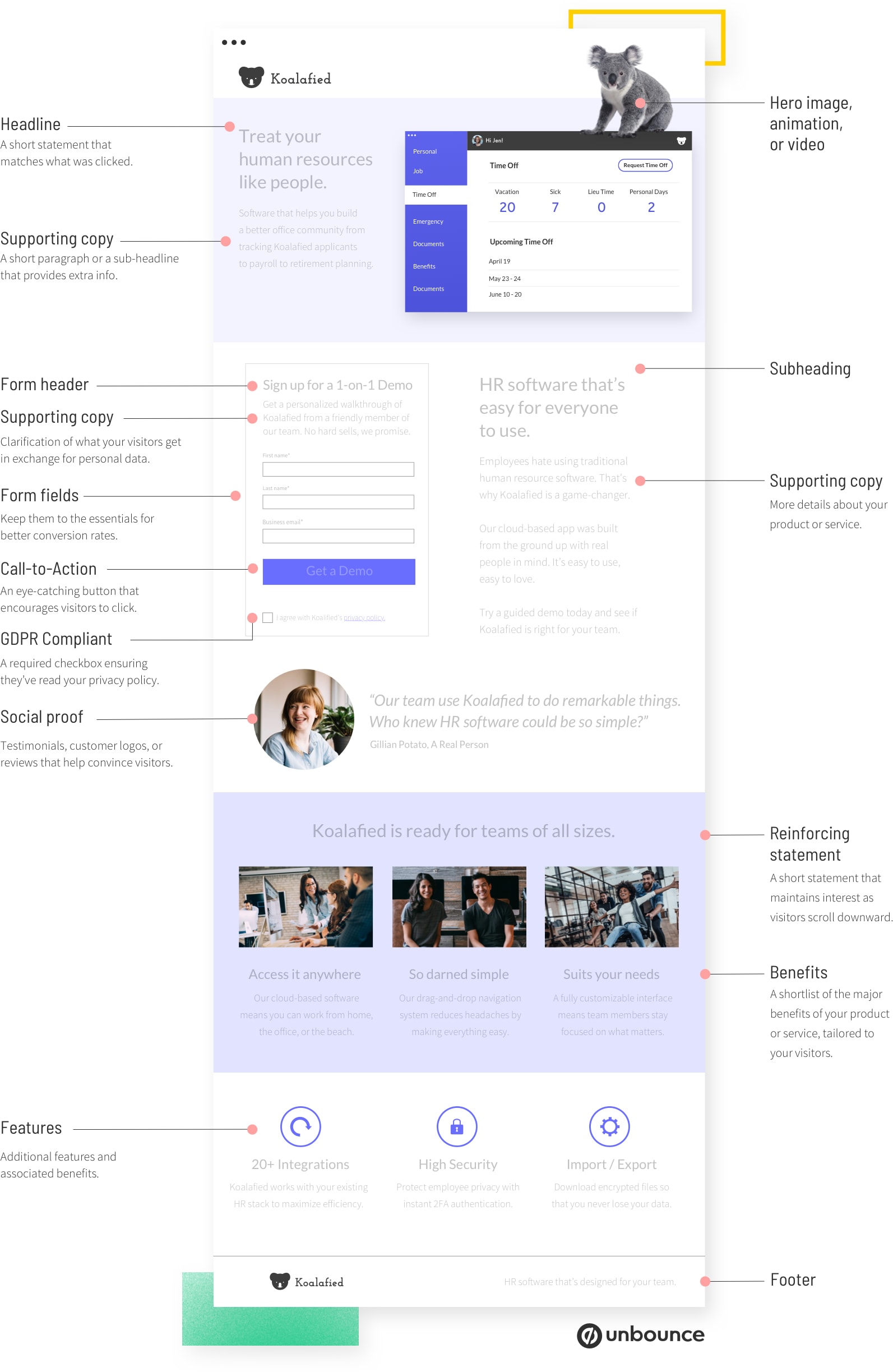
|
| Figure 3.1 Anatomy of Landing Page |
Websites are typically divided into three key elements:
- Header ( logo, essential information and navigation)
- Body (multimedia elements)
- Content (heading 1. 2. 3)
- Navigation Menu
- Footer (copyright information and links )
Week 4 The
Web and Language
Week 4 // UNDERSTANDING WEB
Structure
My About Me Sites:


Week 5 HTML
& CSS
Week 7 CSS Selector
⋆ ˚。⋆୨୧˚ Instruction ˚୨୧⋆ ˚。⋆
Week 1 | Exercise 1 Deadline: April 30
Choose TWO (2) websites from the link given. Review the website that
you've selected carefully, taking note of its design, layout, content,
and functionality. Identify the strengths and weaknesses of the website,
and consider how they impact the user experience. Write a brief report
summarizing your findings and recommendations.
What To Have in The Analysis:
- Consider the purpose and goals of the website, and evaluate whether they are effectively communicated to the user.
- Evaluate the visual design and layout of the website, including its use of color, typography, and imagery. Consider the functionality and usability of the website, including its navigation, forms, and interactive elements.
- Evaluate the quality and relevance of the website's content, including its accuracy, clarity, and organization.
- Consider the website's performance, including its load times, responsiveness, and compatibility with different devices and browsers.
Deliverables:
Write a brief report summarizing in not less than 500 words. You can
include a screen capture of each section or page of the website to
explain. Make sure that the formatting of the report is clear
(heading/subheadings)
Week 3 | Exercise 2 Deadline 15th May 2024
This task is to replicate TWO (2) main pages from the websites
provided in the link below to gain a better understanding of their
structure. Choose any two websites from the link. Follow the original
dimensions for width and height. This exercise aims to enhance your
design skills using software like Photoshop or Adobe Illustrator and
provides insights into web design best practices.
What To Have in The Replication:
- Images and Icons: Use stock images or free stock icons; they don't need to be exact matches but should be similar.
- Fonts: Focus on the layout, typography, and color scheme. Use Google Fonts to find similar typefaces if the original fonts are not available.
- Design Elements: Use shapes to construct arrows and other symbols as demonstrated in class.
- Logos and Symbols: Find similar logos and symbols if the originals are not accessible.
- Technical Skills: For complex backgrounds like gradients, use tools like the eyedropper and create transparent text boxes to filter images.
Deliverables:
Final Comparison: Provide a side-by-side comparison of the original
and replicated versions of the websites.
⋆ ˚。⋆୨୧˚ Exercises ˚୨୧⋆ ˚。⋆
Week 1 // Exercise 1: WEB ANALYSIS
1st Website:
Week 3 // Exercise 2 : WEB REPLICATION
In this week, we were tasked to replicate two main pages from the
provided link to understand their structure. Focus on layout,
typography, and color scheme, using Photoshop or Illustrator. Replace
original images with similar stock images or icons. Download comparable
fonts from Google Fonts. Screenshot the website and replicate the page
to enhance your web design skills.
Mr. Shamsul also provided us some resource to find images and install
font:
Free image:
Google Fonts link:
Firstly, Mr. Shamsul showed us how to screenshot the full page of a
website in Chrome by
right click--> inspect --> run command --> screenshot full
screen then we get a screenshot.png of a website but need to adjust the layout
first before we proceed.

|
| Figure 1.1 Steps to screenshot the webpage |
.png)
|
|
|

Figure 1.3 Font used is Karla and Ms Glorolia


Figure 1.4 Constructing arrows using diamond shapes and divide feature
As for logo, I found the similar shape then use Image Trace feature to
make and expand the image into outlined object so it is easier to adjust
shape and colour

|
| Figure 1.5 Image Trace for Similar Logo |
Final outcome comparison between Original and the Replicated versions
of the websites :

Comparison of Replication (Left) and Original (Right)

|
| Figure 2.1 Screenshot of Ocean Health Index Websites.png |
The font used is all san-serifs so Montserrat, Helvetica, Arial so it is
easier to get from Adobe Fonts and convenient to replicate.

|
| Figure 2.2 Font used shown in inspectors |
The Ocean Health Index site was easier after mastering those skills in
website 1, requiring the eyedropper tool for background gradients and
transparent text boxes to filter images.


|
Figure 2.3 Gradient applied and Low Opacity of
Shape |
Then I found some bubbles png to enhance the coherent of the
original background.

|
|
Figure 2.4 Input of Bubbles elements |
Overall, it was quite easy to understand the layout design and
interface, including the header, body content, and footer of the
websites.
Final outcome comparison between Original and the Replicated
versions of the websites :

Comparison of Replication (Left) and Original (Right)
Week 7 // Exercise 3 : CREATING A RECIPE CARD
In this exercise, Mr Shamsul assigned a task where we need to
create a recipe card using HTML and CSS. The goal is to design
a basic webpage that displays a recipe's ingredients and
instructions in a visually appealing format.
Create an HTML file named "index.html."
Create a section that displays the following
information:
Recipe title
Include necessary images for the page
List of ingredients
Step-by-step cooking instructions
Create an external CSS file named "style.css."
Apply CSS rules to style your recipe card.
Use CSS selectors such as element selectors (e.g., body,
h1, ul), class selectors (e.g., .recipe-title,
.ingredient-list), and ID selectors (e.g., #instructions) to
style different parts of the card.
I have thoroughly looked through the recipe book and discovered my favorite dessert: strawberry scones.
I have carefully compiled the list of ingredients needed to prepare this delightful treat and designed the colour and picture that I would like to input.
⋆ ˚。⋆୨୧˚ Reflection ˚୨୧⋆ ˚。⋆
Observation
Engaging in web replication exercises provided a valuable opportunity to dissect and understand the underlying structure of various websites. I observed how different websites implement their layouts, styles, and functionalities, gaining insights into best practices and common design patterns. These exercises revealed the importance of semantic HTML for content structure and the use of CSS for visual styling. Analyzing the code of existing websites helped me identify efficient coding techniques and the strategic use of elements to enhance user experience.
Experience
Recreating a website structure and designing a recipe cookbook using HTML and CSS was a practical and immersive experience. By replicating existing websites, I learned to pay attention to detail, ensuring that every element was accurately reproduced. Creating the recipe cookbook involved organizing content logically and applying CSS to make the design visually appealing and user-friendly. This hands-on project allowed me to experiment with different layout techniques, color schemes, and typography, enhancing my ability to create well-structured and aesthetically pleasing web pages.
Findings
Through these exercises, I found that replicating websites and creating my own projects significantly strengthened my coding skills. Understanding the structure and design of existing websites provided a solid foundation for my own creations. Working on the recipe cookbook taught me the importance of clean, semantic HTML for content organization and the power of CSS in transforming a simple layout into an engaging user interface. These activities reinforced the value of practice and analysis in mastering web development, ultimately leading to more efficient coding practices and improved design capabilities.


Comments
Post a Comment