Application Design II// Task 2:Interaction Design Planning & Prototyping
25/5/2025 - 8/6/2025 / Week 6 - Week 8
Angel Tan Xin Kei / 0356117
Application Design II / Bachelor of Design (Hons) in Creative Media
In this week, we were introduced to LottieFiles as an alternative to After Effects for designing animations. Mr. Razif highlighted how LottieFiles offers an extensive library of pre-made assets, is easier to use, and can integrate directly into Figma as a plugin allowing us to generate and preview GIFs or animations easily within our design workflow.
Inspired by this, I experimented with some timeline animation features and even tried creating a custom SVG animation using the BMW M Sport logo. This exercise helped me understand how scalable vector animations work and how they can be used in modern UI design to enhance user interaction.
This week gave us not only a solid technical foundation in backend integration and app structure, but also a creative boost through accessible animation tools like LottieFiles—empowering us to bring our applications to life visually and functionally.
 |
| Fig 1.1 Lottieflies Animation in process |

Fig 1.2 Final Outcome of my Logo Animation
This week, we were introduced to FlutterFlow, the primary platform we'll be using to develop our final application. Under Mr. Razif's guidance, we explored the core functionalities of the platform, focusing on building a fully functional user authentication flow including login, sign-up, and dashboard pages.
A major part of the session was learning how to integrate Firebase with FlutterFlow, enabling real-time data handling and secure authentication. We dived into Firebase Authentication, which allows users to register and log in using their email and password. Mr. Razif demonstrated how to configure Firebase in the project settings, and how to connect sign-up and login buttons to authentication actions. Once authenticated, users are directed to a personalized dashboard that displays dynamic content pulled from the Firebase backend.
 |
| Fig 2.1 Integrating Firebase into Flutterflow for authentication |
In addition to the hands-on walkthrough, we gained valuable insights into FlutterFlow's drag-and-drop interface, use of custom functions, and support for low-code development—features that make app development more accessible, especially for those without extensive programming knowledge.
Overall, this introduction to FlutterFlow provided us with a solid foundation for understanding backend integration in app development. It also equipped us with the necessary tools to begin prototyping our own applications confidently.
- Micro Animations:
- Macro Animations:
A. Master Plan & Storyboard
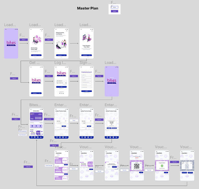
Following Task 1, I have completed the redesign of the The Bites app and now developing a master plan to better understand and map out the app's flow. Moving forward, I created a storyboard that provides detailed descriptions of the interactive animations throughout the app. Each storyboard page is organized into three sections: Onload, Onpage, and Offload.
- Onload Animation refers to animations that play when a page first appears.
- Onpage Animation includes animations that occur while interacting within the page.
- Offload Animation covers animations that happen when elements exit the screen or fade out.

|
|
|
- Start with a solid purple eclipse holebounce into the center of the screen against a neutral background and the black-and-white logo of the Bites jumps inside the eclipse.
- Then, popping back out with a springy ease-out bounce transition into original colour then the eclipse transforms into a circular loading ring begins spinning clockwise like a loading spinner, symbolizing energy building.
- As the ring spins faster, gradients of purple fill into the ring then the loader begins to shrink and pulse in sync with the rhythm then gradient ball bounces once and then blast fills the screen with a gradient background.

|
| Fig 4.1 Masking Shapes |

|
|
Fig 4.2 Masking Animation of Shapes and Logo in Figma |

|
| Fig 4.3 Loading Circle for Splash Scren |

|
|
|
| Fig 4.5 Overview of Splash Screen Animation |
- An intuitive, touch-driven sliding animation where content pages drag with the finger and slide in/out smoothly, mimicking a stack or carousel. Ideal for mobile or tablet interfaces.
- There are three dots represent the current page in a multi-page carousel or slider whihc is like an indicator
- The "Get Started buttons" has different colour effects when hovering and pressing.
 |
| Fig 4.6 Drag and Slide macroanimation |
I have also applied the variation on "Get Started" buttons so that it show the cursors is hovering or pressing the button to make it very engaging.
 |
| Fig 4.7 Variation effects on "Get Started" button |
 |
| Fig 4.8 Onboarding Pages in Figma |
Page transitions feature slide-in and slide-out animations, giving a smooth, directional feel as users navigate between pages.These animations help establish a clear sense of movement and flow throughout the app.
Microanimations:
- Input fields such as Username, Email, and Password use Smart Animate with an Instant / Ease Out transition.
- The landing screen includes a looping gradient bubble animation that gently moves in the background.
The Password input includes a visible/hide toggle icon (eye icon), allowing users to easily view or hide their password for better control and accessibility.
This animation acts as a loading effect, appearing for a few seconds to indicate that the app is initializing, creating a dynamic and modern first impression.
 |
Fig 5.2 looping gradient bubble animation screen |
| Fig 5.3 Animation of Sign up / Log in Pages |
The Home Page uses a slide-up animation from the bottom when first loaded, creating a dynamic entrance and guiding the user's attention.
The Membership Card section allows users to drag left or right to switch between different cards, using smooth sliding animations to mimic physical card-swiping behavior.
From the Home Page, navigating to Vouchers Redeeming pages uses slide-left or slide-right transitions, giving a fluid and intuitive sense of direction.
Pages within the app also support horizontal scrolling, with subtle transitions that reinforce spatial continuity.
Buttons enlarge slightly when hovered over or pressed, providing immediate feedback and enhancing interactivity.
-
Content sections that support horizontal scrolling are animated with ease-in/out effects, making the scroll feel smooth and natural.

 |
| Fig 6.1 Navigation Button Enlarged and Hovering effects |
The Membership Card section is highly interactive as users can swipe left or right to switch between different cards where each card is customizable, users can choose their preferred color, adding a layer of personalization.
This section is built in Figma using components and variants, allowing for seamless interactions and real-time changes within the prototype
 |
| Fig 6.2 Membership Cards Drag and Slide Section |
 | |
|
 | |
|
 |
| Fig 5.4 Confetti GIF in enter promo code vouchers |
| Fig 5.3 Animation of Bites Pages |
- The Onboarding Page is styled as a Voucher Showcase, allowing users to scroll vertically (up and down) through featured vouchers.
- When a user taps on a voucher, it slides up from the bottom, expanding into a full view for more details.
- Within the expanded view, users can navigate between "Available" and "Used" vouchers using a left-to-right horizontal swipe transition, creating a smooth and intuitive experience.
- A confetti animation plays during congratulatory moments (e.g. successfully redeeming a voucher), adding a festive and rewarding touch.
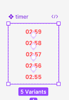
- A countdown timer animation is shown for vouchers that are time-limited, with dynamic motion indicating urgency and remaining time.
- Vouchers respond to hovering with an enlargement and color shift, giving users immediate visual feedback and encouraging interaction.
 |
| Fig 6.1 Variant in Buttons |
 |
| Fig 6.2 Variant in Timer |
 | |
|
C.Final Submission
Prototype Link: https://www.figma.com/proto/sRQed8R8ZsJKgncENAp299/App-Design-2-Task-2--The-Bites-App?node-id=3-45196&t=rHOWZo8yZ8Y0LfYi-1
D.Video Presentation
Youtube Link: https://youtu.be/tNlME0dFpOY


Comments
Post a Comment