
2.12.2024 -7.1.2025 /Week 11- Week 15
Angel Tan Xin Kei / 0356117
Application Design 1 /
Bachelor of Design (Hons) in Creative Media
Final Project
/ Hi-Fi App Design Prototype
⋆ ˚。⋆୨୧˚ Quick Link ˚୨୧⋆。˚ ⋆
⋆ ˚。⋆୨୧˚ Instruction ˚୨୧⋆。˚ ⋆
Module Information Booklet
Submission :
A) Final Project – Completed Mobile Application Design Prototype –
30 %
Students will synthesize the knowledge gained in task 1, 2 and 3 for
application in task 4. Students will create integrate visual asset and
refine the prototype into a complete working and functional product
experience for a selected task.
B) E-Portfolio - 10 %
Students describe and reflect on their social competencies within the
design studio context, supported by evidence. Reflect on how to
empathize with others within group settings, interact positively
within a team and foster stable and harmonious relationships for
productive teamwork. The reflective writing is part of the TGCP.
⋆ ˚。⋆୨୧˚ Final Project: Lo-Fi App Design Prototype ˚୨୧⋆。˚ ⋆
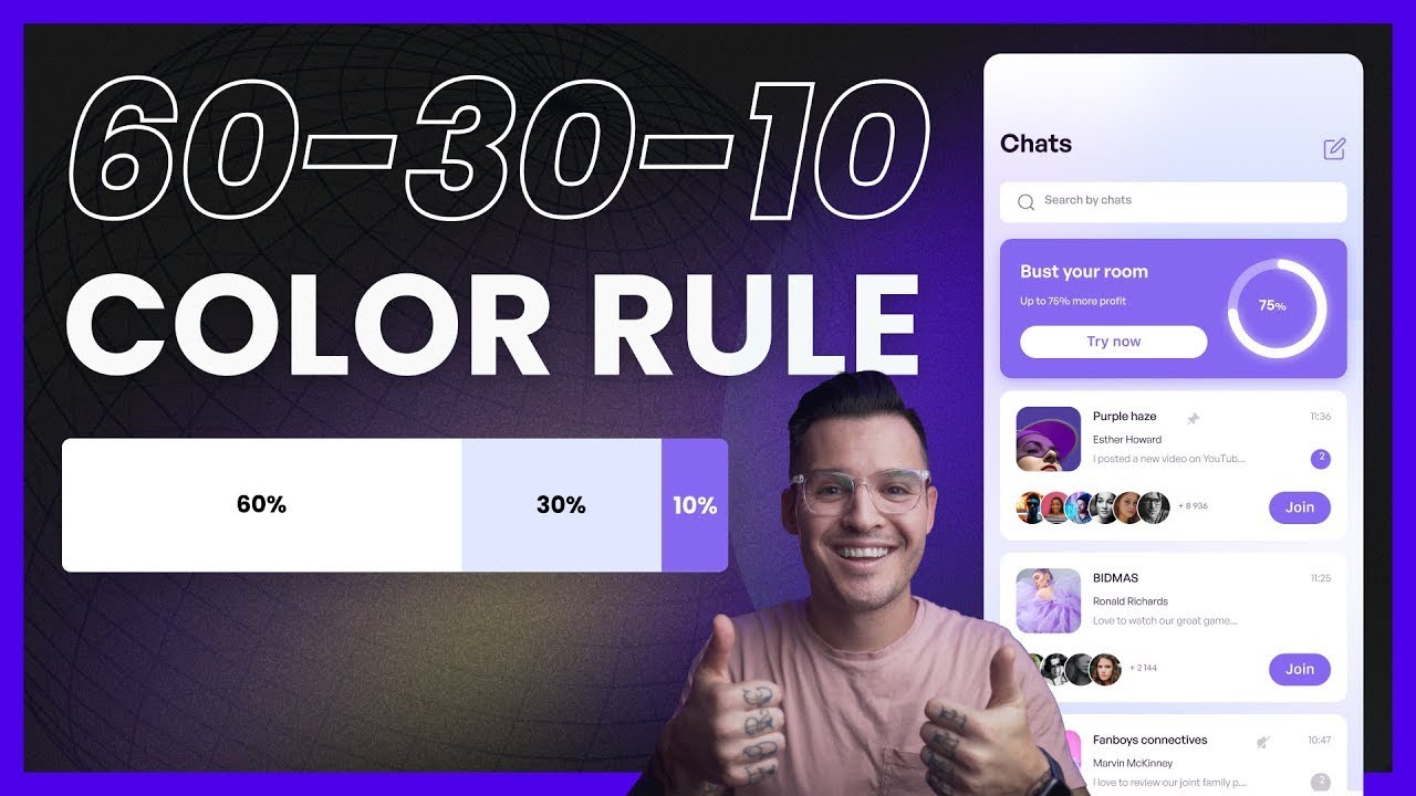
A. Colour Palettes
The color scheme is based on the brand logo, with slight modifications
with lighter shades of purple are used to create better contrast for
headings and text. For body text, black is used to maintain readability.
To ensure a balanced and cohesive design, I referred to presentation
slides and watched several YouTube tutorials before deciding on
a monochromatic color palette.

|
|
Fig 1.1 Color Scheme Used for High-Fidelity
|
I also applied the 60/30/10 rule to distribute the
color ratio effectively across different sections, enhancing the overall
visual harmony of the app.
Final UI Kit Prototype :
Fig 1.3 Finalized UI Kit
After studying the rules and lectures slide, I decided to utilize the
most contrast shade of color navy blue to be button and navigation bar
as it bring the most outstanding color out of purple tone which capture
users' attention which essential to lead to clickable button.

|
|
Fig 1.4 Button Color
|
B. Illustrations
I have selected several images and vectors from Freepik and Pinterest
that align with the purple theme of my grocery shopping app. These
visuals were chosen to replace the lo-fi wireframe pictures to
complement the app's design and enhance the overall user experience with
the smooth animation.

|
|
Fig 2.1 Vectors from Freepik websites
|
|


Fig 2.2 Vectors from Pinterest
I replaced all the photo icons with to real pictures to make the design
more realistic. Initially, I had included the company logos but it was
quite challenging as the layout became too cluttered and overwhelming
sometimes for users.

|
Fig 2.3 Replacing Images onto Prototype
|
C. Consultation
I have did consultation with Mr.Zeon regarding my Hi-Fi Prototype and
he commented that the tier overview lacks interactivity, which can lead
to users feeling disengaged and overwhelmed by the static information.
To make the tiers more interactive by enabling a hover function, when
users hover over a specific tier, detailed information about that tier
could be displayed. This interaction will make the experience more
dynamic and informative, helping users easily understand the benefits of
each tier without feeling bogged down by excessive text. By introducing
this feature, users will find the tier information more engaging and
easier to digest.

|
|
Fig3.1 Enhancing the UX of My Loyalty Page
|
The voucher section currently feels somewhat bland, and it's
suggested to alternate the background color of the vouchers to
introduce more contrast. By doing so, the vouchers will stand out
better against the rest of the page and draw more attention from the
users. This change will make the section visually more engaging and
help users quickly spot available vouchers, enhancing their overall
experience with the app.

|
Fig3.2 Switch the color tone of Voucher Background
|
|
Fig 3.3 Overall Design of Hi-Fi Prototype
D. User Testing
Moving to the next phase, which is usability testing, similar to the
previous task, I have already created three scenarios/tasks with
detailed descriptions that require users to perform specific actions
within the application.
Recordings:
Users Testing Review:
Summary and Analysis of User Testing
E. Improvement
i. Alternate the Icon in the Membership Section
I have changed the icons to white and made them bolder to ensure
they align better with the other visual elements on the homepage.
This adjustment enhances the overall design consistency and
visibility, improving the user experience.
Fig 4.1 Icon in the Membership Section
ii. Add a CTA-Button on View Voucher Section
I have added a distinct button for the "Promotions & Deals"
and "View Vouchers" sections, as users found it confusing to
locate the voucher page. This addition helps clarify where to
tap, improving navigation and overall user experience.
Fig 4.2 Adding a Button on View Voucher Section
iii. Bolder the "+" sign icon for Add to Cart
I have made the plus sign icon bolder, as users mentioned that it
might be difficult to click when it's too simplified. This
adjustment improves the icon's visibility and makes it easier for
users to interact with.
Fig 4.3 Colored the "+" sign icon
iv. Refined the "Add to Bag" Icon
I have modified the "Add to Bag" icon to purple, as it fits
better with the overall design, enlarged and repositioned it
closer to the left. Previously, it was positioned too far in the
top-right corner, making it less intuitive for users. This
change improves both visibility and usability.
Fig 4.4 Illustrated the "add to bag" icon
v. Add Image on the Track Order Section
I have added images for the "Track Order" button, as users did
not realize there was an option to track their order. The
addition of images makes the button more visible and helps
guide users to this feature more easily.
Fig 4.5 Input image as button to click
Figma Link:
Prototype Link:
Walkthrough Video Presentation of Final Hi-Fi Prototype:
⋆ ˚。⋆୨୧˚ Feedback ˚୨୧⋆。˚ ⋆
Week 14
General Feedback
Proceed to the high-fidelity design once the low-fidelity version is
checked and good to go. Additionally, it's important to conduct user
testing and analyze the results on the presentation slides to ensure
the design meets user needs and expectations.
Specific Feedback
Voucher Page: The voucher section feels bland, so it's suggested to
alternate the background color of the vouchers to create more contrast
and make it stand out better.
Tier Overview: The tier overview should be made more interactive. It
was suggested that when users hover over a tier, detailed information
should appear. Without this interaction, the overall information feels
boring and overwhelming to users.
Week 15
General Feedback
The submission must be on time.
Specific Feedback
Everything is fine but the spacing for the gold tier bar could be
lowered to improve its alignment or visual balance.
⋆ ˚。⋆୨୧˚ Reflection ˚୨୧⋆。˚ ⋆
Experience
The project required me to apply and refine the knowledge and skills gained
throughout the course, enabling me to merge visual assets into a functional
prototype in Sigma. Experimenting with illustrations, images, and different
features underscored the significance of maintaining visual consistency and
focusing on user-centered design. This practical experience deepened my
understanding of design principles and their effect on user experience.
Observations
Throughout the project, I noticed that selecting visual UI design elements
and minimalist while high readability typography greatly enhanced the app's
usability. The addition of visual cards and spending analysis charts was
well-received by users, making the app more intuitive and engaging. Feedback
from peers and Mr. Zeon was instrumental in refining the design. By
prioritizing visual hierarchy, clear imagery, and concise text, I created a
more streamlined and user-friendly interface, which was crucial for ensuring
user satisfaction.
Findings
The key takeaways from this project emphasized the importance of user
feedback in the design process. Implementing suggestions, such as adding a
home button and visualizing data, not only improved functionality but also
enriched the overall user experience. The project demonstrated that
selecting the right visuals and presenting clear, concise information are
essential for effective communication and user engagement. These insights
will inform future design projects, highlighting the need for continuous
iteration and a focus on user-centered design.


Comments
Post a Comment