Advanced Typography Task 1: Exercise - Typographic Systems & Type and Play

22.4.2024 - / Week1 - Week 4
Angel Tan Xin Kei / 0356117
Interactive Design / Bachelor of Design (Hons) in Creative Media
Task 1/Exercises: Typographic Systems & Type and Play
⋆ ˚。⋆୨୧˚ Index ˚୨୧⋆。˚ ⋆
- Lecture
⋆ ˚。⋆୨୧˚ Lecture ˚୨୧⋆。˚ ⋆
Week 1 Advanced Typography : Typographic Systems
Typographic systems is similar to architects term
shape grammars
which is a set of rules that is unique and provide sense of purpose that
focuses and directs decision making. It allows learners to have an
exploration by developing their intuition mature.
Axial System: All elements are organised to the left or
right of a single axis.

|
| Figure 1.1 Example of Axial System |
Radial System: All elements are extended from a point of
focus.

|
|
|
Dilatational System: All elements expand from a central point in
a circular fashion.

|
|
Figure 1.3 Example of Dilatational System |
Random System: Elements appear to have no specific pattern or
relationship.

|
|
|
Grid System: A system of vertical and horizontal
divisions.

|
|
|
Transitional System: An informal system of layered
banding.

|
|
|
Modular System: A series of non-objective elements that are
constructed as a standardised unit.

|
|
|
Bilateral System: All text is arranged symmetrically on a single
axis.

|
|
|
Conclusion : The system might be awkward at the beginning but it will
emerges creative potential as it develops, break free from rigid
horizontal and vertical.
Week 2 Typographic Composition
Typographic composition is the arrangement of textual information on a
given space.Some of the most common composition are emphasis, rule of
thirds and grid system.
Principles of Design Composition: Emphasis, isolation,
repetition, balance (symmetry/asymmetry), alignment, perspective, rhythm,
contrast.

|
| Fig 2.1 Principle of design-emphasis |
The Rule of Thirds : a photographic guide to composition, it basically suggest that a
frame (space) can be divided into 3 columns and 3 rows. The intersecting
lines are are used as guide to place the points of interest, within the
given space.

|
| Fig 2.2 The rule of Thirds |
Artists like David Carson, Barnbrook and Paula Scher pushed the
boundaries. Incredible amount of planning and intuition were used to
create exciting compositions. Below are some examples from the
artists.

|
| Fig 2.3 Examples of Post-Modernist |
Environmental Grid: Based on the exploration of an existing
structure or numerous structures combined.

|
| Fig 2.4 Form and communication |
Form and Movement: Based on the exploration of an existing
Grid Systems. The placement of a form on a page, over many pages creates
movement. The forms could represent images, text or colour.
Week 3 Context & Creativity
Handwriting
- first mechanically produced letterforms were designed to directly imitate handwriting
- become the basis or standard for form, spacing and conventions mechanical type would try and mimic. shape and line of hand drawn letterforms are influenced by the tools and materials used to make them. Sharpened bones, charcoal sticks, plant stems, brushes, feather and steel pens all contributed to the unique characteristics of the letterform
- material upon which the forms were written: clay, papyrus, palm leaf, animal skins (vellum and parchment) and paper

|
|
Fig 3.1 Evolution of the Latin Alphabet |
- As ideograms, to represent the things they actually depict
- As determinatives to show that the signs preceding are meant as phonograms and to indicate the general idea of the word
- As phonograms to represent sounds that "spell out" individual words

|
| Fig 3.2 Ancient Egypt Hieroglyphics Chart |
- Early greek (5th C. B.C.E.): Drawn freehand, not constructed with compasses and rules, and they had no serifs. In time the strokes of these letters grew thicker, the aperture lessened, and serifs appeared.
- Roman Uncials: By the 4th century Roman letters were becoming more rounded, the curved form allowed for fewer strokes and could be written faster.
- English Half Uncials (8th C.): In England, the uncial evolved into a more slanted and condensed form.
- Carolingian Minuscule: Capitals at the start of a sentence, spaces between words and punctuation. It was this style that became the pattern for the Humanistic writing of the fifteenth century; this latter, in turn, was the basis of our lower-case roman type.
- Black Letter (12-15 C. CE): Characterised by tight spacing and condensed lettering. Evenly spaced verticals dominated the letterform. Condensing line spacing and letter spacing reduced the amount of costly materials in book production.
- The Italian Renaissance: Newly rediscovered letterforms Antica. The renaissance analysis of form that was being applied to art and architecture was directed toward letterform — resulting in a more perfect or rationalised letter.

|
|
Fig 3.3 Letterforms through the ages |
Evolution of Middle Eastern Alphabets: the Phoenician letter
marks a turning point in written language- use of sound represented in
letters the script itself has been possibly influenced by the Egyptian
Hieroglyphics and Hieratic Scripts.

|
| Fig 3.4 Evolution of Middle Eastern Alphabets |
The Evolution of the Chinese script: From the Oracle bone to Seal
Script to Clerical Script, Traditional and Simplified scripts.

|
| Fig 3.5 The Evolution of the Chinese script |
The Italian Renaissance: Newly rediscovered letterforms Antica. The
renaissance analysis of form that was being applied to art and architecture
was directed toward letterform — resulting in a more perfect or rationalised
letter.

|
| Fig 3.6 ‘Indian’ subcontinent the Indus Valley Civilization (IVC) script |
The oldest writing found in the ‘Indian’ subcontinent the Indus Valley
Civilization (IVC) script (3500-2000 BCE), is as yet undeciphered and seems
to have been somewhat logo-syllabic in nature.

|
| Fig 3.7 Brahmi script (450–350 BCE) |
The earliest writing system developed in India after the Indus script.Most
influential writing systems; all modern Indian scripts and several hundred
scripts found in Southeast and East Asia are derived from
Brahmi.
 |
| Fig 3.8 Southeast Asia scripts, scripts of the communities that assimilated into Peninsula Malay communities |
Handwriting
Jawi, the Arabic-based alphabet, was introduced along with Islam
In Modern Malaysia, Jawi is of greater importance because it's the script
used for all our famous works of literature. Every hikayat and Malay charm
book is written in Jawi. Unlike Indonesia, we don't have a huge wealth of
pre-Jawi inscriptions and writings this part of the reason why some tend to
ignorantly claim that Jawi is "tulisan asal Melayu", which is of course
untrue.


Programmers and Type Design
More vernacular scripts are being produced by software giants (Google):
more vernacular and "multi-script" typefaces - a term coined by Muthu
Nedumaran are being produced to cater to situations where the written
matter is communicated in the vernacular script or vernacular and Latin
scripts.

|
| Fig 3.10 Programmers and Type Design |
Week 4 Context & Creativity
Designing Type
Why design another typeface?
Xavier Dupré (2007), in introducing his typeface Malaga, suggested two
primary reasons for designing new typefaces:
- Social Responsibility: Enhancing legibility continuously is essential due to the social responsibility type designers bear.
- Artistic Expression: Typeface design serves as a medium for artistic expression.
Type Design Process:
1. Research:
- Gain an understanding of type history, anatomy, conventions, and terminologies.
- Identify the typeface's intended purpose and potential applications
- Analyze existing fonts for inspiration, ideas, context, and usage patterns.
2. Sketching:
- Traditional Method:Some designers prefer traditional tools (brushes, pens, ink, paper) for sketching, later scanning these sketches for digitization. They find better control and confidence with hand-drawn sketches
- Digital Method: Others use digital tools, like Wacom tablets, to sketch directly into font design software, which is faster and more consistent, though it might limit natural hand movements.
3. Digitization:
- Professional software like FontLab and Glyphs App are commonly used
- Some designers start with Adobe Illustrator before moving to specialized font software, though purists often criticize this approach.
4. Testing:
- Testing helps refine and correct the typeface.
- Prototyping provides valuable feedback.
- For text typefaces, readability and legibility are crucial, while display typefaces prioritize form and expression.
5. Deployment:
- Even after deployment, minor issues may arise that were not identified during prototyping and testing
- Continuous revision is necessary, emphasizing the importance of thorough testing to minimize post-deployment problems.

|
| Fig. 4.1.1 Deploy |
Typeface Construction:
Using grids, particularly with circular forms, can aid in the design and
creation of letterforms.

|
|
Fig. 4.1.2 Construction grid for Roman capitals (8 x 8 cells)
|
Construction and Considerations: When designing a new typeface,
different forms and constructions must be considered. Visual
corrections, such as extending curved and protruding forms slightly past
the baseline and cap line (overshoot), are important. This also applies
to the vertical alignment between curved and straight forms.
Fitting the Type: Adjustments are necessary to achieve a uniform
visual white space between letters, ensuring consistent spacing that
appears visually even.

|
| Fig. 4.1.3 Classification according to form and construction |
Week 5 Perception and Organisation
Perception:
- is defined as "the way in which something is regarded, understood, or interpreted."
- This raises the question: is perception based on what you see and understand, or is it influenced by manipulation?
- In typography, perception involves guiding the reader's visual navigation and interpretation through contrast, form, and organization of content. Content can be textual, visual, graphical, or colorful, with a focus on typography here.
Contrast:
- Size: Contrasting sizes draw the reader's attention to larger elements first, often used to differentiate titles or headings from body text.
|
| Fig. 4.1.4 Size (by Carl Dair) |
- Weight: Bold type stands out among lighter type of the same style. Besides bold text, using rules, spots, or squares can create areas of emphasis.

|
| Fig. 4.1.5 Weight |
- Form: Contrast of form distinguishes between capital and lowercase letters, roman and italic variants, and condensed versus expanded versions of typefaces.


Fig. 4.1.6 Form
- Structure: Different letterforms of various typefaces, like monoline sans serif versus traditional serif, or italic versus blackletter, create structural contrast.
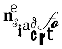
Fig. 4.1.7 Structure
- Texture: Combining size, weight, form, and structure contrasts creates texture in a block of text. Texture involves the overall appearance of lines of type both up close and from a distance.


Fig. 4.1.8 Texture
- Direction: Contrast of direction involves the interplay between vertical and horizontal elements and the angles between them. Turning a word sideways or mixing different text block orientations can create dramatic effects.

Fig. 4.1.9 Direction
- Color: Adding a second color can be less striking than black on white. The emphasis should be on which elements to highlight and the tonal values of the colors used.

Fig. 4.1.10 Color
Overall:

Fig. 4.1.11 Contrast
- Form: This refers to the visual representation and aesthetic of typographic elements, balancing function and expression.
- The term originates from the Greek words "typos" (form) and "graphis" (writing), meaning writing in accordance with form.
- Typography serves to represent concepts visually, showcasing the unique characteristics and abstract presentations of letterforms.


Fig. 4.1.12 Form
Organisation
Gestalt: Gestalt theory posits that the whole is greater than the sum of its
parts, emphasizing unified experiences over individual components.
Perceptual organization or grouping in Gestalt theory includes several
principles:
- The Law of Similarity: Elements that are similar tend to be perceived as a group, based on features like color, orientation, size, or motion.
- The Law of Proximity: Elements close to each other are perceived as a group, while those further apart are not.
- The Law of Closure: The mind tends to see complete figures even if parts are missing or obscured.
- The Law of Good Continuation: We perceive intersecting objects as distinct and uninterrupted, with alignment playing a crucial role.
⋆ ˚。⋆୨୧˚
Instruction ˚୨୧⋆。˚ ⋆
Module Information Booklet
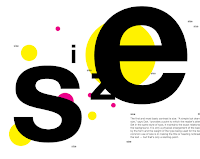
Exercise 1 : Typographic Systems (Week 1)
- Understanding how visual elements are organized helps designers gain a deeper insight into the design process
- Using the 8 systems (Axial, Radial, Dilatational, Random, Grid, Modular, Transitional and Bilateral) to be explored using the following content:
The Design School,
Taylor’s University
All Ripped Up: Punk Influences on Design
or
The ABCs of Bauhaus Design Theory
or
Russian Constructivism and Graphic Design
Open Public Lectures:
June 24, 2021
Lew Pik Svonn, 9AM-10AM
Ezrena Mohd., 10AM-11AM
Suzy Sulaiman, 11AM-12PM
June 25, 2021
Lim Whay Yin, 9AM-10AM
Fahmi Reza, 10AM-11AM
Manish Acharia, 11AM-12PM
- Employ various typographic organization systems to create messages that engage readers in different ways, expanding the possibilities of typographic communication
- Task to be done using Adobe InDesign only (Size 200 x 200 mm).
Exercise 2: Type and Play (Week 2 & 3)
Instructions for Finding Type Project
- Choose an image of a man-made object (e.g., chair, glass) or structure (e.g., buildings). Alternatively, select an image from nature (e.g., human, landscape, leaf, plant, bush, clouds, hill, river).
- Analyze and dissect the selected image
- Explore the identified letterforms then digitize the letterforms through an iterative process.
- Refine the forms from crude representations to more polished versions, reflecting their origins.
- Combine the refined letterforms with a visual of your choosing.Enhance and support the interplay between the letterforms and the selected visual.
- Ensure the text and image form a symbiotic relationship.
⋆ ˚。⋆୨୧˚
Practical ˚୨୧⋆。˚ ⋆
Task 1 : Exercise 1
- Typographic Systems
Week 1 First Attempt
Throughout this exercise, our task is application of the eight systems
that we have learnt —Axial, Radial, Dilatational, Random, Grid, Modular,
Transitional, and Bilateral—in InDesign using the provided content from
the MIB. Additionally, we've been advised to view the InDesign
demonstration videos available in the lecture playlist.
These are my InDesign Progress and my trial and error:

|
|
Fig 1.9.1 Axial System Ver.1
|

|
|
Fig 1.9.2 Axial System Ver.2
|

|
|
Fig 1.10 Axial System Ver.2
|

|
|
Fig 1.11 Radial System
|

|
|
Fig 1.12 Random System
|

|
|
Fig 1.13 Modular System
|

|
|
Fig 1.14 Grid System
|

|
| Fig 1.15 Dilatational System |

|
| Fig 1.16 Bilateral System |
Week 2 Modification
After online consultation with Mr.Vinod, I have made some changes
regarding the feedback
Axial: Mr Vinod commented that he like the third design is good.
 |
| Figure 4.2.1 Axial System in jpg |
Radial:The second design title could be presented in another font to look more emphasis.
 |
| Figure 4.2.2 Radial System in jpg |
Dilatational: Both design is okay.
 |
| Figure 4.2.3 Dilatational System in jpg |
Modular: First design's content should be more align whereas second one is good look like a conetent page.
 |
| Figure 4.2.4 Modular System in jpg |
Random: First one suits the random theme whereas second one is too organised can be develop more.
 |
| Figure 4.2.5 Random System in jpg |
Grid: first one refrained from making the word transparent to ensure it doesn't compromise readability.
 |
| Figure 4.2.6 Grid System in jpg |
Transitional: second design is too oragnised can be more curvy but first one can alternate other fonts
 | |
|
Bilateral: can add more shapes to enhance the overall visual design
 |
| Figure 4.2.8 Bilateral System in jpg |
Final Compilation:
Fig. 4.4 Final Compilation without Grid in pdf
Fig. 4.3 Final Compilation with Grid in pdf
Task 1: Exercise 2 - Type and Play
Part 1: Finding Type
A. Image Selection:
Initially, I opted for cream because I love desserts 🧁 with cream,
but Mr. Vinod pointed out that cream's fluid nature just like water,
which adapt to the shape of its container, failed to showcase a
distinct identity. Consequently, I decided to switch my focus to coral
reefs 🪸 . This choice better aligns with the project's
objectives, offering a more tangible and recognizable subject that can
be explored effectively for its unique characteristics and visual
appeal.The reason why I chose coral is that I love diving. When diving
underwater, the lively and colourful coral reefs make create a
thriving and vibrant ecosystem for marine life.
Source Link: Coral Reefs from Pinterest

|
| Fig. 2.2.1 Pink Corals (week 2, 29/4/2024) |
B. Analysis and Dissection:
Currently engaged in a letterform extraction process inspired by the
observing the vibrant colors, diverse shapes, and organic textures
found within these reefs. Specifically, I am tracing out the letters
L-O-V-E-Y, drawing upon the curves, patterns, and visual harmony
reminiscent of coral formations.

|
|
|
C. Exploration and Digitization:
Throughout the exploration of letterforms from the coral reefs, I
extracted these forms and embark on a journey of digitization
characterized by iterative refinement.
Gradually, I transformed them from rough representations into more
polished versions, drawing parallels to the elegance of Futura italic.
This evolution not only captures the essence of coral movements,
reminiscent of their gentle swaying in the ocean, but also ensures
that the original inspiration from coral reefs remains vividly
preserved in the final typographic designs.

|
|
Fig. 2.2.2 Refer to Futura Italic (week 2, 29/4/2024) |

|
|
|
Then, I made some refinement as in stroke heights, angle adjustment,
font width, stroke adjustment, stroke detailed. Then, I realised we
are re-utilising the skills we have learnt in Typography class like
tracking and kerning the typeface to narrow down the width.

|
|
Fig. 2.2.3 Process of Adjustment (week 2, 29/4/2024) |
First Finalised Letterform, it has become more simplified and
harmony in term of same typeface but at the meantime conserve the
characteristic of coral reefs.

|
|
Fig. 2.2.3 Comparison of Before and After Adjustment (week
2, 29/4/2024) |
D. Reference and Refinement:
After Mr. Vinod told me to observe the intricate details of coral
reefs more closely, I noticed tiny spots on the branches that I hadn't
initially noticed. He then guided me to incorporate these small spots
into my letterforms, emphasizing the importance of capturing such
small details.

|
|
|
This process involved meticulously imitating these features and
integrating them into the design, enriching my letterforms with the
subtle yet impactful elements found in coral reef structures.
By auditing these details, my typographic creations now reflect a
deeper appreciation for the beauty and complexity of coral reefs,
guided by Mr. Vinod's insightful advice to observe and emulate
nature's smallest details.

|
|
|

|
|
|
Final of Finding Type in PDF Format:
|
Fig. 3.2.3 Final of My Type in PDF (week 3, 2/5/2024) |
Part 2: Type Showcase
Combination with Visuals:
After finalizing our letterforms, we were tasked with creating a
mock movie poster using these designs. The primary goal was to
enhance both the letters and the chosen image, ensuring they
complemented each other seamlessly.I opted to incorporate the
original photo of the coral reefs. Then, I realised the letterform
are too odd and bland to be white colour so I made it more vibrant
and feel more like a realm life of real coral.

|
|
|
In Illustrator, I added a 3D effect extrude to the letterforms so it
looks more outstanding.

|
| Fig. 3.2.4 Process of 3D and Extrude the Wording (week 3, 2/5/2024) |
-13.jpg)
|
| Fig. 3.2.4 First Attempt of Movie Poster (week 3, 2/5/2024) |
-14.jpg)
|
|
|
.jpg)
|
|
Fig. 4.2.2 Final Outcome of my Movie Poster (week 4,
7/5/2024) |
|
Fig. 4.2.3 Final Outcome of my Movie Poster (week 4,
7/5/2024) |
⋆ ˚。⋆୨୧˚ Feedback ˚୨୧⋆。˚ ⋆
Week 4
General Feedback:
To create a more visualise movie poster, ensure the title is
large enough to immediately catch the audience's attention.Keep
other elements like logos and content smaller to avoid
distracting the audience. Use a background picture that
corresponds to our reference image to integrate seamlessly with
the title.
Specific Feedback:
Position the wording centrally to ensure balanced
composition.Use subtle 3D effects sparingly to emphasize the
words and poster. Minimize empty space around the words to
maximize visual impact.
Week 3
General Feedback:
Examine the stroke width of each letter to ensure that the
shape is the same. Fonts must maintain the qualities and
showcased the characteristic of the image that we have picked.
Beyond that, designed typefaces should be the star of the show
when you move on to the poster. Just be careful with the size
and arrangement of the text to prevent them from taking over the
entire piece.
Specific Feedback:
I should avoid using cream as my inspiration because it is
too fluid like water and easily adapts to the shape of its
container. Instead, I decided to focus on coral reefs or
bamboo. Mr. Vinod suggested that coral reefs are a better
choice, as the shape of bamboo, being always straight, is
more challenging to trace. Additionally, I should provide
more detail in the coral design by incorporating some beads
to enhance its appearance.
Week 2
General Feedback:
It's important to consider the hierarchy and order of
information to ensure readability. Avoid using red or any
dark colour text on a black background.Please keep the angle
of text within 45° for better readability.
Specific Feedback:
Axial: Third design is good
Radial: The second design title could be presented in another font to look more emphasis
Dilatational: Both design is okay
Modular: FIrst design's content should be more align whereas second one is good look like a conetent page
Random: First one suits the random theme whereas second one is too oragnised can be develop more
Grid:first one refrained from making the word transparent to ensure it doesn't compromise readability.
Transitional: second design is too oragnised can be more curvy but irst one can alternate other fonts
Bilateral: can add more shapes to enhance the overall visual design
Week 1
General Feedback:
Mr.Vinod started briefing for overall modules and
lecture, then he also assigned task 1.
⋆ ˚。⋆୨୧˚
Further Reading ˚୨୧⋆。˚ ⋆

"Butterick’s Practical Typography" by Matthew Butterick
Source Link :
https://practicaltypography.com
What is Typography?
Typography is the visual component of the written word. It involves the
art and technique of arranging type to make written language legible,
readable, and visually appealing. Typography is present in all text that
is visually displayed, whether it’s on paper, a computer screen, or a
billboard.
The Nature of Text and Typography
Text Consistency: A text, such as the sentence "I like pizza," remains
the same irrespective of how it's rendered. It can be printed on paper,
read aloud, or saved digitally, and it will still be the same sequence
of words.
Typography's Role: When text like "I like pizza" is visually displayed,
typography comes into play. This includes everything from the choice of
font to the arrangement of text on a page or screen.
Examples and Considerations:

Signage: The difference between two signs lies not in the text but in
the typography. Typography encompasses the choice of typeface, size,
spacing, and layout that makes the text visually distinct.
Art vs. Utility: Typography, much like photography, can be considered an
art form when executed with a high level of skill and creativity.
However, both have a fundamental utilitarian function. Effective
typography is more about possessing good skills than merely having good
taste.
Common Misconceptions
Typography vs. Fonts: Typography should not be conflated with fonts.
While fonts are a component of typography, the field encompasses a wider
range of considerations about the visual appearance of text, such as
spacing, alignment, and overall layout.
By mastering the technical and aesthetic aspects of typography, one can
significantly enhance the readability and visual appeal of written
communication.
What is Good Typography?
Good typography enhances the meaning of the text it presents. It
supports the message by making the text more effective in communicating
its intended points, instructions, or warnings.
Key Principles of Good Typography:
1.Reinforces Meaning:
- Typography should enhance the message of the text, making it clearer
and more impactful.
- Example: A speed limit sign uses a font that is legible from a
distance and under various conditions, ensuring the message is conveyed
quickly and clearly.
2.Context-Dependent:
- Typographic choices should be tailored to the specific
text and its purpose.
- Different texts require different typographic treatments
to best support their messages.
3. Utilitarian Focus:
- Typography is primarily about utility rather than
aesthetics.
- Effective typography is judged on how well it serves the
text’s purpose, not on its visual appeal alone.
- For instance, highway signage needs to be clear and
legible, even if it appears less aesthetically pleasing than other
fonts.
4. Flexibility:
- There are multiple typographic solutions for any given
text, and many can be equally effective.
- Good typographers avoid relying on one-size-fits-all
solutions and instead adapt their approach to suit the specific text and
context.
Examples:
- The most effective speed limit sign emphasizes the number 75
and the words "speed limit" to ensure the message is clear at a glance.
- Poor typographic choices can obscure the message, reducing the
sign’s effectiveness.

Common Misconceptions:
Invisibility of Typography:
- Some argue that the best typography is “invisible,” meaning it
doesn’t draw attention to itself but rather lets the message shine
through.
- This idea, popularized by Beatrice Warde's essay "The Crystal
Goblet," suggests that good typography should be unobtrusive.
- However, typography is not just about being invisible; it
should actively support and enhance the text’s message.
⋆ ˚。⋆୨୧˚ Reflection ˚୨୧⋆。˚ ⋆
Experience:
Engaging with the Typographic Systems exercise was an enlightening experience
that deepened my understanding of how visual elements can be organized to
convey messages effectively. Using the 8 typographic systems required a
thorough exploration of each approach's unique characteristics. For instance,
the Axial system's linear arrangement provided clarity and structure, which I
like the most.As for task 2, I get to trace out the letterform weirdly but yet
still readable then make it into a movie poster was quite engaging.I just
faced some issued when refine the detailed of letterform as it shouldn't be
totally simplify but need to conserve the pattern and characteristic was quite
challenging.
Observation:
Observing the impact of each typographic system on the overall design revealed
significant insights. The Random system, despite its inherent lack of
structure, successfully captured the chaotic energy of "All Ripped Up: Punk
Influences on Design," challenging me to balance readability.For Task 2, the
thing I realised is that everywhere or everything in life can be traced out as
typographical elements, when we seek for those things, it allowed for
flexibility within a structured framework, such as fluid movement of rack,
bamboo shoots, breaking glass elements, reflecting the evolving nature of
design concepts.
Findings:
Through the Typographic Systems exercise, I discovered that each typographic
system offers unique strengths and challenges that significantly impact the
design outcome. Each system's structured are proved to have designated
communication ways such as Radial and Dilatational systems introduced dynamic
and visually engaging layouts. However, the Random system, despite its initial
chaotic appearance, provided a unique way to convey energy and spontaneity,
perfect for themes like punk influences in design. Lastly, I learnt that movie
poster font size should always be the main focus for audience to remember
their name and create a long-lasting impact also for enhancing the dual themes
in content. These findings highlighted the importance of selecting the
appropriate system to enhance message delivery and engagement in design.
⋆ ˚。⋆୨୧˚ Quick Links ˚୨୧⋆。˚ ⋆
- Advanced Typography Task 2
- Advanced Typography Final Project
- Back to Top


Comments
Post a Comment