Major Project 1
3/2/2025 - 28/3/2025 / Week 1 - Week 7
Major Project 1 / Bachelor of Design (Hons) in Creative Media

- Instruction
- Task 1: Proposal Development
- Task 2: Design Preposition
- Task 3: Concept Presentation
- Feedback
- Reflection
- You are to work as groups in presenting an innovative concept that introduces unique social, cultural and/or economic value to the intended target audience within your chosen field of specialization.
- You are to conduct research on current technology and design trends that influences and benchmarks your area of specialization.
- Case studies with analysis reports on product/service functionality and effectiveness, technical innovations and challenges, aesthetics and design appreciation are required to support your new project proposal.
- You can submit your Presentation Slide (Progressive work up to Week 3). Please refer to the Task 3 submission deliverables.
- Individual Presentation Slide that summarize your project work and deliverables, including Figjam or Miro board (up to Task 3)
- Name your Presentation slide as 'Name_GroupName_No.Supervisor'. For example, LiaoXiaoNing_MakanBuddy_DrWongCY
- Continue on developing user insights and data from user interview
- Develop User Personas based on user research data
- Develop User Journey Map
- Group Presentation Slide that summarizes your group project work and deliverables, including Figjam or Miro board (up to Task 2).
- Format for submission: (i) Presentation Slide (including links for all your raw data, material, Figjam board etc); (ii) PDF file (up to Task 2).
- Only Project Leader needs to submit on behalf of your group. Please remember in your slide mentions ALL the project members' names, and student ID, and Supervisor's name.
- Brainstorm ideations using storyboarding, sketches etc.
- Design inspiration from other design resources/websites for ideations
- Develop Information Architecture (i.e. Card Sorting Method) for your proposed solution
- Develop User Flow/Work Flow diagram
- Design Design Guideline (colour scheme, typography, UI component etc) that is related to the project topic and targeted user personas
- Initial Lo-fi prototype (sketches or wireframe)
- Your presentation slide (which contains all members' ePortfolio links, Figjam/Miro board link, Figma (if any), document (if any) etc.
- PDF format
-
Only Group Leader need to submit. Please name the file as
'Groupxx_GroupName/ProjectName'.

The aim of this app is to create a safe, convenient, and reliable platform that helps parents find trusted childcare, access parenting support, and discover kid-friendly places easily. It reduces the stress of managing childcare by offering verified babysitter connections, community support, and smart features for hassle-free planning.
Objectives:
- This app helps parents find trusted babysitters quickly, including last-minute and emergency childcare options with real-time tracking. It ensures safety by allowing parents to choose babysitters with verified profiles, background checks, and ratings from other parents. First-time and single parents can also get support through a parenting community where they can share advice, ask questions, and find emotional support.
- Parents can easily connect with verified babysitters and childcare providers using a secure booking system with direct payments. The app also helps families discover kid-friendly places like restaurants and play centers, offering reviews, discounts, and recommendations. Expecting parents can get help from experienced mentors, attend live Q&A sessions, and access helpful parenting guides to prepare for childcare challenges.
- To make things even easier, smart features like AI recommendations, automatic scheduling, and reminders help parents manage their childcare needs with less stress.
- Primary Audience: New parents, busy working parents, and single parents.
- Secondary Audience: Expecting parents, relatives, babysitters, and kid-friendly businesses.

- The purple box contains the HMW questions tailored to each target audience.
- The blue box outlines the solutions and what users can expect in the future.

- A single mother of one kid aged 7.
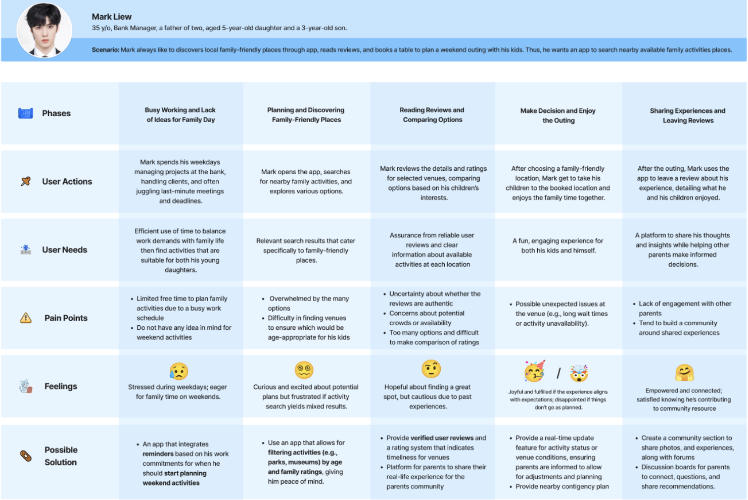
- A father of two, aged 5-year-old daughter and a 3-year-old,.
- A mother with a newborn baby.

Interview Questions:
In Week 3, we finalized our interview questions and had them reviewed by our supervisor. After receiving approval to proceed, we began finding interviewees and collecting responses. Once all the data was gathered, we analyzed the results using diagrams for better visualization and insights.

Synthesize user interview data:
- Demographic


- Goals and Challenges


- Existing Solution & Limitations


- Ideal Solution


- Mother
- Single Mother
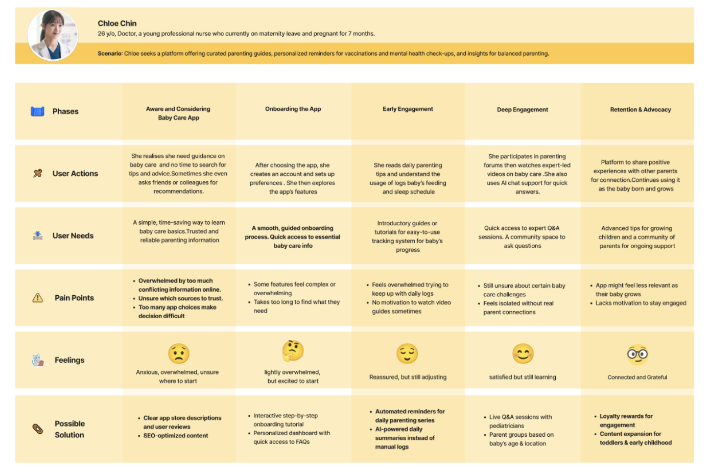
- Pregnant Mother
- Babysitter
- Owner of a Children’s Play Centre


Before conducting card sorting with participants, we first had an internal discussion to refine and categorize features into different groups. These features were determined based on insights from our interview results, user personas, and user journey map.
A= Closed Card Sorting B= Open Card Sorting- Find a Babysitter
- Emergency Babysitter
- Backup Babysitter Matching
- Reviews & Ratings
- Preferred Babysitters List
- Baby Sitters Live Updates
- Verification & Background Checks
- Verified Babysitter Profiles
- Emergency Contact
- Push to talk Button (Buz)
- Live Location
- Parenting Knowledge Hub
- Live Workshops
- Child Development Tips
- Time Management Tips
- Budgeting & Financial Planning for Childcare
- Parents Stress-relief Guides
- Expert Advice
- Baby Development Milestones
- Emergency Tips
- Map of certified kid-friendly places
- Exclusive discounts & rewards for parents
- Baby Care Rooms (Nursing Rooms, Diaper Changing Stations)
- Kid-Friendly Parks & Play Areas
- Virtual Tours
- Baby Shop
- Parent Meetups & Events
- Expert Q&A Forum
- Direct Messagings
- Parents’ Forum
- Local Parent Groups
- Single Parents’ Community
- Parenting Marketplace
- Favorite Babysitters
- Favorite Location
- Child Profiles
- Order / Booking History
- My History
- Notifications
- Family Profiles
- Personal Details
- Notification Preferences
- Privacy & Security Settings
- Family Calendar Integration (Sync Calender)
- Manage Passwords
- FAQs
- Customer Service Contact
- Referral & Rewards Program
- Cancellation & Refund Policy
- Booking Reminders & Alert
- Exclusive discounts & rewards for parents
- Babysitters Subscription (Monthly/ Year)
- Payment Method
- Biometrical Payment (Face ID / Fingerprint)


.png)

|
|
Fig 4.1 Overall Wireframe (12.3.2025 -Week 7)
|

|
| Fig 4.2 Overall Wireframe (20.3.2025 -Week 7) |
You can proceed by combining the three ideas—parking and study place finder, internship finder, and events information—into a single solution. However, you will need to develop a clear problem statement that defines the core issue your app aims to address.
Good. Just need to include more details of the target audience.
- Indicate how users can identify verified babysitters (e.g., badge, tick, or certification label).
- Create another user persona from the babysitter’s or kid-friendly business’s perspective to understand their needs and challenges.
- Modify the wireframe to clearly label specific content areas (e.g., "Add Image" icon, profile boxes, rating section) for better clarity.
Designing the low-fidelity wireframe for the baby app was a challenging yet insightful process. The main focus was to create a user-friendly structure that prioritizes essential features like safety, babysitter booking, parenting resources, and community support. One of the key challenges was organizing these features within a five-tab navigation bar while ensuring easy access to important functions. To solve this, I carefully structured the app with Home, Safety, Babysitters, Community, and Profile, placing Booking History under the Babysitters tab and integrating Family-Friendly Places into Home or Community.
This process emphasized the importance of hierarchy and prioritization in UX design. Since parents using the app may be busy and stressed, the wireframe needed to be clear, simple, and easy to navigate. I ensured key safety features like the SOS button and emergency contacts were placed in a dedicated tab for quick access, while the Community tab provided a space for parents to connect and share advice. The challenge was making trade-offs—keeping the interface uncluttered while still providing all necessary features in logical locations.
Through this task, I gained a deeper understanding of balancing functionality with simplicity in app design. Prioritizing user needs and accessibility helped shape a more intuitive layout. Moving forward, I plan to refine the wireframe based on feedback, develop a high-fidelity prototype, and ensure the final design remains seamless and stress-free for parents. This experience reinforced the importance of user-centered design in creating effective and practical digital solutions.


Comments
Post a Comment